
Rate me! by SoulReaper
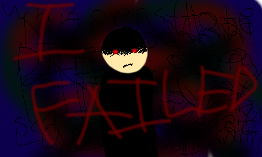
This is a previous pic. First, take a look. Now, rate the atmosphere (How creepy/dark it is) Now, once you have your number (1-10), take a closer look. The poor background, which is just lines, and a slendy symbol, and the poor art style, and how badly I drew myself. Did I have you under the spell, or did I fail at atmosphere, and you see right through it? (No offence taken, regardless. I'm curious.)
Comments
2
like
reference image
eraser
eyedropper
time taken
nsfw
flip
undo
paint with friends
private
used tools icons
500
100
25
5
1
The comment has been reported
The Colors! Gallery moderators will look at it as soon as possible.
delete comment?
just delete
delete comment and prevent this user from commenting on your paintings
report as inappropriate
confirm
Comments
21 Apr, 2013, 6:40 am
Ps: Those are honest words, I just wasn't trying to have good calligraphy at the moment. (My handwriting is ok. Just not THAT bad.)
24 Apr, 2013, 5:30 am
8