
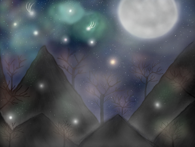
Starry Mountains by ElliDawn
Okay so I listened to some peoples advice & changed this a little, Does it look any better now or did I make it worse? Tell me what you think, I hope you like it. Thanks! ^-^
Comments
9+
like
reference image
eraser
eyedropper
time taken
nsfw
flip
undo
paint with friends
private
used tools icons
500
100
25
5
1
The comment has been reported
The Colors! Gallery moderators will look at it as soon as possible.
delete comment?
just delete
delete comment and prevent this user from commenting on your paintings
report as inappropriate
confirm
Comments
24 Mar, 2013, 2:35 am
i love it this look really good ^-^
24 Mar, 2013, 2:52 am
Thaaaaaaank you *o*
You job is so great <3 c: you had talent!!
24 Mar, 2013, 2:55 am
It's really pretty
24 Mar, 2013, 3:09 am
So pretty! I feel as if I am in a dream :D.
24 Mar, 2013, 4:14 am
Now it looks 30 percent more Charming! ^w^
24 Mar, 2013, 5:54 am
Oh my! This looks so magical! The 3D and mist lighting is really spectacular! Amazing job!
24 Mar, 2013, 6:19 am
Sorry to say but I actually prefer the other one. But this is still good
24 Mar, 2013, 8:08 am
yeah i think it's better without that cloud blocking the perfect moon :3 and i love the misty green around those few stars :)
24 Mar, 2013, 11:41 am
I'm not sure which one looks better. They both look lovely :)
24 Mar, 2013, 2:12 pm
I love it!! thanks for commenting my stuff:)
24 Mar, 2013, 2:46 pm
I think this one's better. The bright mist looks good.
24 Mar, 2013, 5:17 pm
Yeah, I like this one better. Awesome work.
24 Mar, 2013, 8:23 pm
Yeah, it looks better without the cloud.
24 Mar, 2013, 10:25 pm
i like both, but i do think the origonal was good (sorry)
25 Mar, 2013, 6:17 pm
I like the original, except for the moon. I like this one's moon better.
26 Mar, 2013, 9:08 am
umm~~ i like the original one better but taking out the cloud from where the moon was is great ideas! but it still look really nice ^^
26 Mar, 2013, 12:48 pm
So amazing! ^_^ I really do enjoy night scenery. :3
28 Mar, 2013, 9:53 am
Great use of the 3D, this picture really has depth to it. The moon looks so realistic.
28 Mar, 2013, 5:55 pm
Perfect Art XD
30 Mar, 2013, 5:17 am
Not bad. Here's a little tip: the closer something is, the richer the colours and the darker the values. The further away an object is, the less pure the colours (looks more washed out, fading towards blueish-white) are and the lighter the values. Research "atmospheric perspective," if you want to get a more deep understanding. Good luck!
30 Mar, 2013, 10:18 pm
THIS IS AMAZING! :D *liked*
01 Apr, 2013, 12:48 pm
awsom!
03 Apr, 2013, 8:06 pm
Nice pic! I love it ^_^
11 Apr, 2013, 3:34 pm
YOU'RE IN TOPRANKED!!!!!