
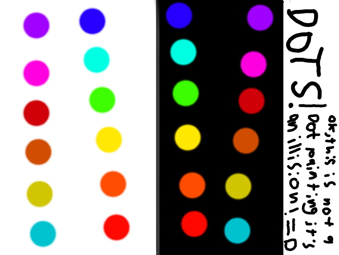
A better Color Contrast Illision by 3Dpainter
the dots on the black side are brighter than the dots on the white side. I did not change colors to make it look like they contrast, honest!
Comments
3
like
reference image
eraser
eyedropper
time taken
nsfw
flip
undo
paint with friends
private
used tools icons
500
100
25
5
1
The comment has been reported
The Colors! Gallery moderators will look at it as soon as possible.
delete comment?
just delete
delete comment and prevent this user from commenting on your paintings
report as inappropriate
confirm
Comments
16 Feb, 2013, 11:10 pm
it kinda looks the same
16 Feb, 2013, 11:11 pm
it is a slight contrast but it is there
16 Feb, 2013, 11:14 pm
looks a bit darker on the dots on the white side -3- hmmm... idk...