
I Am by Eclair
Completed: 2/1/13
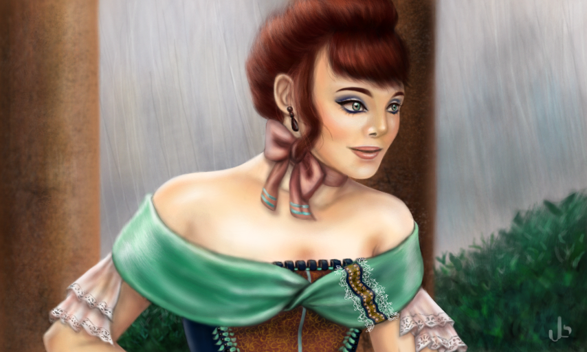
All original character, concept, etc.. I spent too much time playing with the linework and later had to redraw most of the face--so, this took a little while. I think I made a mistake drawing the lady: in that she looks scary or perhaps, has a scary red-headed look.
Comments
9+
like
reference image
eraser
eyedropper
time taken
nsfw
flip
undo
paint with friends
private
used tools icons
500
100
25
5
1
The comment has been reported
The Colors! Gallery moderators will look at it as soon as possible.
delete comment?
just delete
delete comment and prevent this user from commenting on your paintings
report as inappropriate
confirm
Comments
03 Feb, 2013, 5:10 am
I love the shading! :D
03 Feb, 2013, 5:23 am
This is amazing!
03 Feb, 2013, 7:25 am
Did you use any references? That style of clothing and cloth in general can be difficult. I'm just wondering. I go crazy sometimes trying to find a good reference pic for little things like that. Great job by the way. I wouldn't say scary.
03 Feb, 2013, 8:58 am
No, I was to lazy. The mint green part of the dress was inspired by a portrait of Empress Elizabeth of Austria that saw some time ago. I've been trying to expand out of my cell shaded look--but I still feel as if all of the material I draw resembles molded clay. I need to keep experimenting and colors needs to give us more brushes. :]
03 Feb, 2013, 8:59 am
And thanks too.
03 Feb, 2013, 9:00 pm
You artstyle is uniquely amazing. I love it.
05 Feb, 2013, 12:04 am
this is great, very well done!
16 Feb, 2013, 2:12 am
Incredible detail in her embroydery...Amazing!!
16 Feb, 2013, 6:38 am
If you really want to learn about painting realism you should try working directly from a reference a few times. I would challenge you to paint a portrait to look just like a photo (of some generic historical figure or something). You might learn more and get a more realistic look if you choose someone older, with wrinkles, or perhaps smiling (a big smile).
17 Feb, 2013, 7:21 am
Yes, it's hard. I've done a few portraits from reference in graphite (my preference for experimentation) and it is very educational. I do use reference when I can. Actually, I've been trying to gather a good collection of black and white photography for a reference collection and I've been digging through galleries of several digital artists that have amazing realism skills (Melanie Delon for example). Above all else though, I have a real struggle with perspective--may I ask if you have any advice in that matter?
17 Feb, 2013, 7:30 am
When I have some time, I'll accept that challenge--I'll probably even break the six hour limit.
17 Feb, 2013, 9:19 pm
I say "would" challenge you, but you can challenge yourself better than I. You paint what you want. As far as perspective: If you haven't done point perspective, then look into that, but I imagine you probably already have. Often far away or less focused objects will be painted with fewer strokes and details. Not blurry, but not as detailed. This is done to maintain focus on the subject and is common in portraits as well; The eyes are crystal clear, but the ears and neck, not as much, maintaining focus on the eyes. Also farther away things look lighter, or more specifically, more the color of the atmosphere. In a bright blue sky a nearby tree will look dark and green, but the same tree seen from far away would look lighter and bluer. If, in this painting for example, you felt like making the background shrubs farther away, you could make them ligher, with less details and highlights. To make them seem closer, add more details and highlights. I hope that somewhat answers your question, or at least makes sense. If you have any more, feel free to ask. Good luck Eclair. Keep busy.
17 Feb, 2013, 11:03 pm
Thank you, I will.
23 Feb, 2013, 2:34 pm
Amazing!!
15 Mar, 2013, 4:58 pm
I like her face, it has a soft feel. And great details on the clothing. Also very nice to read the helpful comments from Aaron
01 Apr, 2013, 2:11 pm
Great work :)*
13 Apr, 2013, 12:04 pm
Color me impressed!
13 Jun, 2013, 12:21 pm
Great Work