
reference image
eraser
eyedropper
time taken
nsfw
flip
undo
paint with friends
private
used tools icons
500
100
25
5
1
The comment has been reported
The Colors! Gallery moderators will look at it as soon as possible.
delete comment?
just delete
delete comment and prevent this user from commenting on your paintings
report as inappropriate
confirm
Comments
04 Jan, 2025, 3:42 am
@tall73 this so good HOWW!!?? TOT
04 Jan, 2025, 3:44 am
This looks realistic!!
04 Jan, 2025, 3:52 am
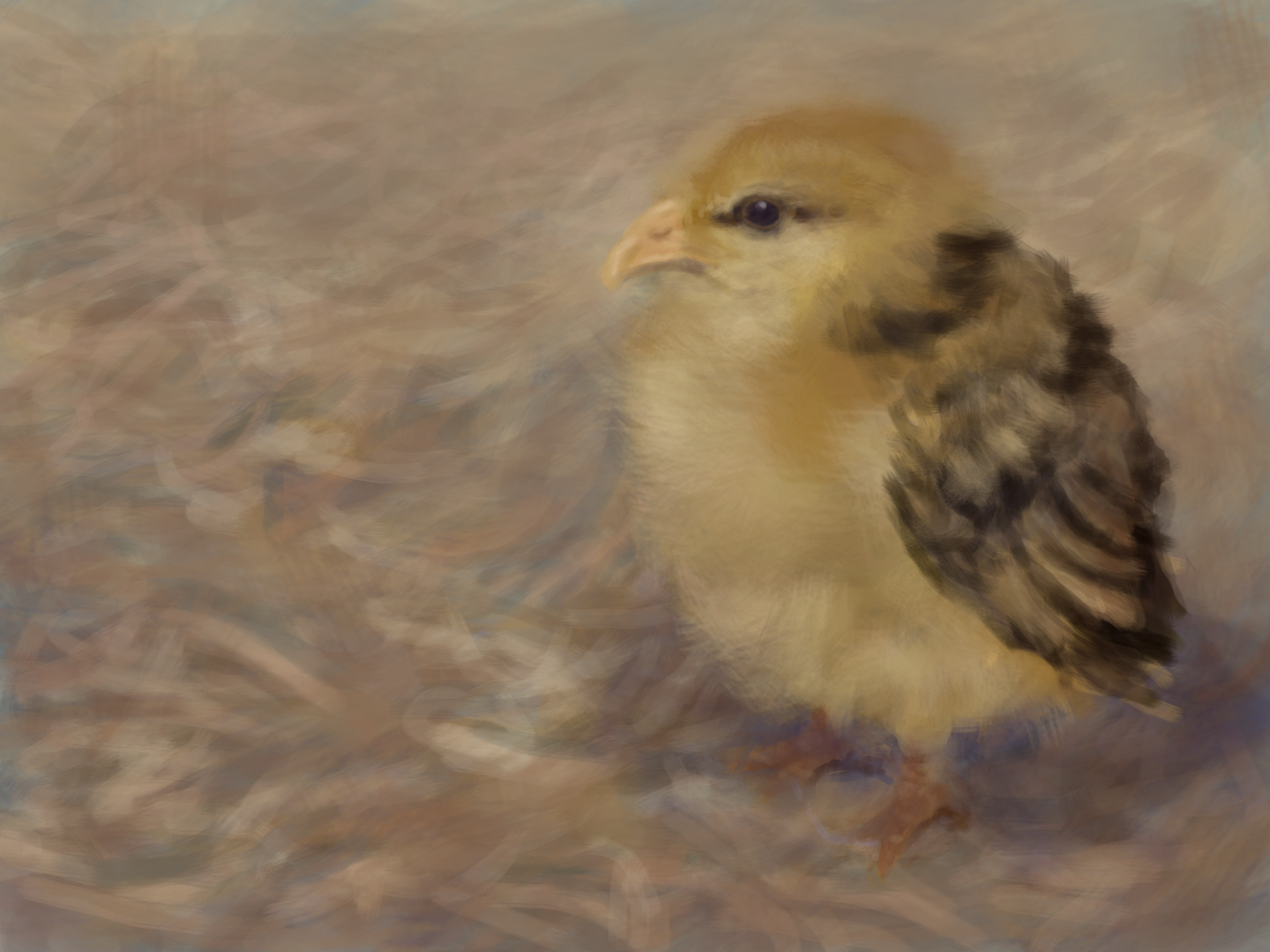
@_PUMPKIN_ How? Mostly a very large classic bristle brush to give Mr. Fluffy his fluff.
For more, see here: #tallstips
04 Jan, 2025, 3:53 am
@tall73 aw ty for the tips i might try them out!! :p
04 Jan, 2025, 3:54 am
@tall73 also Mr. Fluffy is the cutest name ever!!
04 Jan, 2025, 4:25 am
So Cute! I hope You Win!
04 Jan, 2025, 5:08 am
This is amazing!! :O I love the brush strokes! <3
04 Jan, 2025, 5:09 am
Also, such a cute name for this!! ^w^ Mr fluffy is adorable!!
04 Jan, 2025, 12:36 pm
@aspenica ;me
04 Jan, 2025, 12:38 pm
@P4st3lTheAlgabralien NO me
04 Jan, 2025, 12:39 pm
@aspenica ME ilobe birdw
04 Jan, 2025, 12:40 pm
@P4st3lTheAlgabralien does owls countAs birds .i forgot
04 Jan, 2025, 12:41 pm
@aspenica yes
04 Jan, 2025, 12:44 pm
@P4st3lTheAlgabralien THEN ME ilove bird too
04 Jan, 2025, 12:44 pm
i .am 1# birb fan
04 Jan, 2025, 12:45 pm
@aspenica NUH IM #1 BIRD FAN
04 Jan, 2025, 12:47 pm
@P4st3lTheAlgabralien NUH UYH
04 Jan, 2025, 12:48 pm
@aspenica pluah !
04 Jan, 2025, 6:11 pm
@Rewrite-
Thank you. I will start with the brush question. I use mostly Android, and previously the 2DSXL. I have the PC version, but I have limited experience regarding the brushes on the PC and Switch.
However, with some minor sizing differences, etc. the classic brushes are still in the Switch and PC versions, so I will speak to those.
Most of the time I use the classic bristle brush, especially for texture.
If you size it up a lot you get more texture. Sometimes I will use a brush much larger than the area I want to paint, just for the texture. Remember, you can make an area larger than you need on a new layer, then erase part of it, if you are going for a certain texture. I usually erase at about a quarter opacity or below for this technique, so I can more subtly remove areas, rather than leave a sharp edge. For a number of tasks I may erase at just slightly above lowest opacity. Sometimes instead of erasing, it may be best to use the bristle brush to paint in the background to match the inter-weaving pattern of the object. This way the large bristle pattern with the large brush mathes on the edge of the object because you are using the same brush for the background and object. This is particularly helpful for fur, feathers, etc. It has been mentioned in the past, it would be nice if they would eventually make a bristle brush shaped eraser! The bristle brush is also good for making hard lines, with a more opaque setting, but softer areas with a less opaque setting.
Generally I paint with lower opacity. That has its drawbacks, but half down to just a bit above zero is the range I use most of the time. If I really need a harder line I will move it up above that.
Sometimes, if you get really low opacity with the bristle brush, you get a little bit of noise or artifacting, so be aware of that. It can be used intentionally, but most of the time it may mess things up.
You can see an example of what I mean in this painting where I used it to generate texture/effect: #bristlebrushnoise
04 Jan, 2025, 6:11 pm
The classic flat round can also be good for some textures, again using lower opacity, so that you can build up tones
The flat round at smaller sizes can be used to draw in more nuanced texture or details, but can easily become overpowering at higher opacity.
It is hard to control the softness of the edge with that brush. So the others are better for softening edges.
I also find if I want to adjust the overall look of a painting I can use the flat round in a thin (less opaque) new layer over the entire painting of a solid color, and then erase some areas where I don't want the effect. This can also help unify the colors a bit, add sheen, etc. You can use this to tint to slightly different colors (or even colorize a greyscale painting), to increase saturation by using a more saturated tone, to decrease saturation by skewing to the grey, etc.
You can do the same with bristle and soft brushes, but it will tend to introduce blurriness more often.
04 Jan, 2025, 6:12 pm
The soft round brush is good for blending, but you don't want to overdo it. I tend to blur things a bit as it is. So I only use the soft brush in certain areas, often after laying down tone with other brushes.
Particularly in skies and sunsets the soft brush can be helpful, but you don't want to blur everything. I generally avoid the bristle brush in skies altogether, using either the flat or the soft.
I suggest doing entire paintings with each brush, even if it is not ideal so that you get a feel for what each does. So, for instance, this was all soft round brush. #t73soft At higher opacity you can stil get hard lines if you work at it, and it is very easy to blend.
Also, as @Acchan noted years ago, the brushes at lower opacity are easier to blend, and once you have the blend you can duplicate that entire layer to get more opaque quality. Now that the Switch and PC version have variable layer opacity, that gives you even more flexibility for handling that task. Also regarding texture, if you want more realism, use less line. Think in terms of shadow, light, areas of tone rather than outlines, or defining lines. Some things in life have lines, such as inorganic items, but most things don't.
As to colors and shifting the tone, etc. I tend to think color temperature helps a lot.
In daylight settings this may often mean skewing the highlight towards the yellow part of the color wheel, while also increasing brightness slightly, and the shadows towards the blue, while decreasing brightness.
Even if you don't go into actual blues, just heading that direction within a general color is something the eye pick up on. So a more purplish red looks colder than a yellowish red.
You may also have better results skewing to the less saturated as you go through the color wheel as greys tend to work together better than heavily saturated colors.
If you haven't read the other tips here, they might also help: #tallstips
05 Jan, 2025, 2:59 am
BIRD! this is Adorable! :heart: w :heart:
05 Jan, 2025, 7:26 am
Aww this is cute.
06 Jan, 2025, 3:03 pm
OMG SO CUTE
11 Jan, 2025, 1:50 pm
^ ikr
11 Jan, 2025, 2:58 pm
This is brilliant!!
25 Jan, 2025, 2:31 pm
so fluffy and cute
26 Jan, 2025, 10:08 am
Awww how! <3