
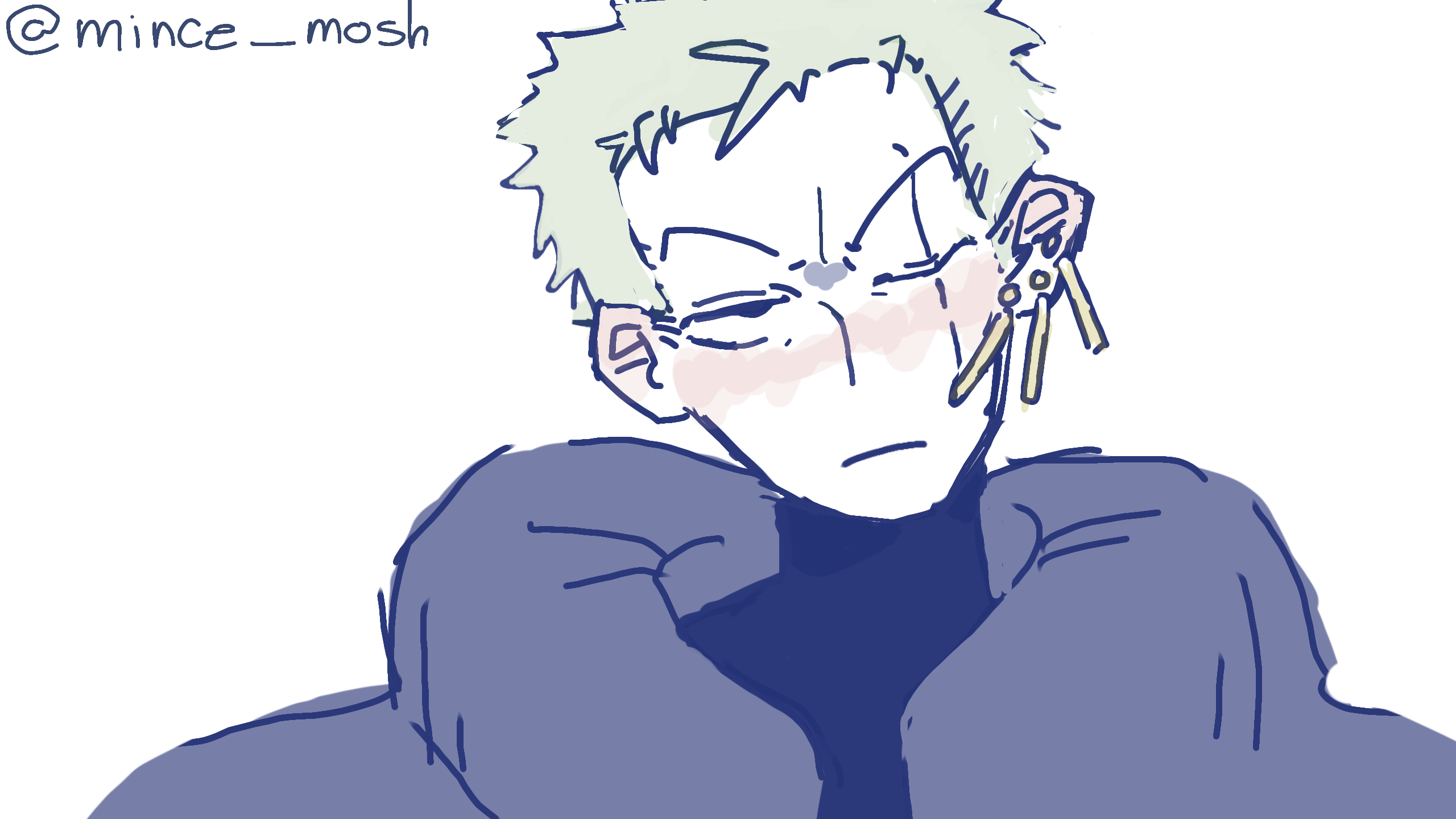
zyorororo by mince_mosh
wowee i actually used paler colours for once and not make everything red
#OP #onepiece #zoro #roronoazoro
Comments
6
like
reference image
eraser
eyedropper
time taken
nsfw
flip
undo
paint with friends
private
used tools icons
500
100
25
5
1
The comment has been reported
The Colors! Gallery moderators will look at it as soon as possible.
delete comment?
just delete
delete comment and prevent this user from commenting on your paintings
report as inappropriate
confirm
Comments
17 Jan, 2024, 4:02 pm
HOTTTTTTT :sob: :fire:
19 Jan, 2024, 3:35 am
@ThatChurro THANK YUUUU
19 Jan, 2024, 3:36 am
@O_Choccy_Milk ikr im being :sparkles: different :sparkles:
07 Feb, 2024, 6:45 am
@-ssandshark- IKR I NEED THEM FOR REASONS
1: mossi boui
2: pretty and yellow
03 Sep, 2024, 12:13 pm
oooh i rlly like the colder feel of this drawing compared to ur previous ones.. i feel like the paler ur darker/warmer are the more of like a serious look u achieve...? like i love how u still made zoros piercings stand out rlly well despite the colors being all pale and muted etc - like its still something u can pick out despite the tone. cool/dimed tone colors = more serious impression on details,, emphasis on subtlety. warm/bright tone = makes color pop, more fun & expressive. boom in yo face
03 Sep, 2024, 12:16 pm
imo!! also i jus love the way u did this drawing in gen it looks v fresh n yk cool like a cucumber while still having ur awesome charm... i think tats what i admire ab u/ur art sm n how ur able to pop out n still be urself regardless of ur creative medium bc speaking from personal experience it can be something vv hard to master or even get good at n im glad to see ur passion n hardwork pop in ur expressive art ahhh its so immersive n powerfull to look at <33333333