
Critique by CharacterDesignClub
@BLuE666 #critiquemyoc
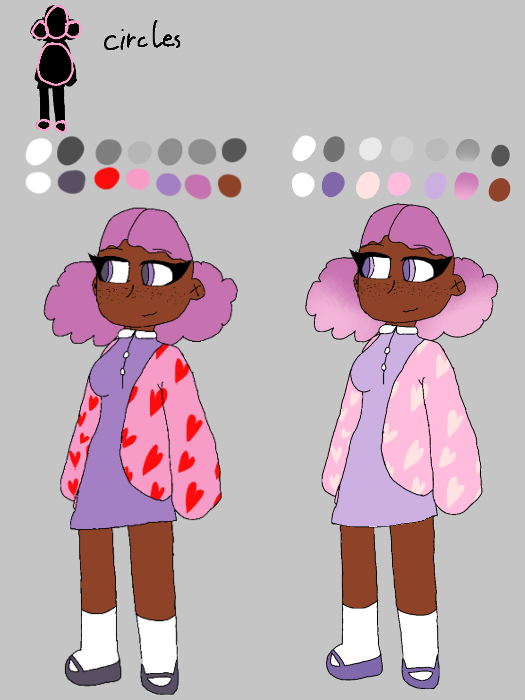
Just gonna do bullet points it's presumably easier
- Changed most colors to be slightly more tinted/pastel (lighter)
- Pointed out the circles in the design (since you said you wanted cutesy and circles often convey that)
- The bright red on the hearts stood out a bit too much
- Color and value comparison
This is mostly just an example of an alternate color palette that I thought would fit the look you talked about more you may take it or leave it
-Una
Comments
2
like
reference image
eraser
eyedropper
time taken
nsfw
flip
undo
paint with friends
private
used tools icons
500
100
25
5
1
The comment has been reported
The Colors! Gallery moderators will look at it as soon as possible.
delete comment?
just delete
delete comment and prevent this user from commenting on your paintings
report as inappropriate
confirm
Comments
02 Jan, 2024, 7:58 am
@CharacterDesignClub OMGG I REALLY LOVE IT!! ITS MINE IM TAKING IT TYTY
02 Jan, 2024, 5:39 pm
do we make a drawing for the collab?