
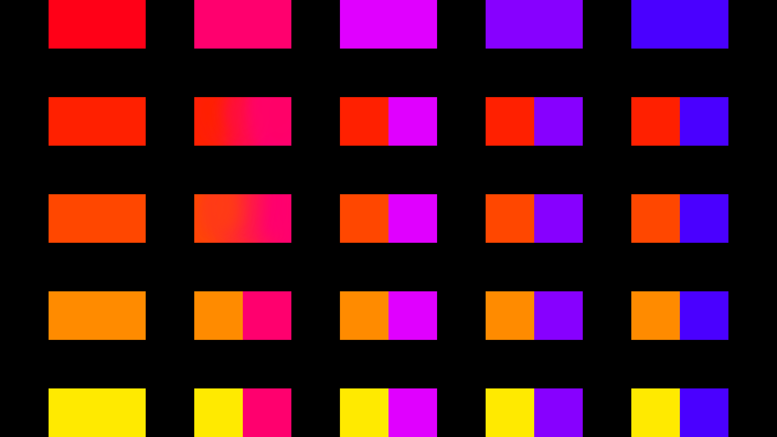
da chart by razrdraws
red going opposite ways on the color wheel, was going to blend them but got bored and stopped at two... yeah.. thats a raz move
Generally using a pair of the variants presented can give a certain mood
(i.e. Purple/Orange = Somewhat spooky
Pink/Orange = Beautiful sunset theme lol)
Obviously the presented pairs give room for variation and experimentation in a painting. I dont know if this method has a technical name, but this is for fun.
Comments
3
like
reference image
eraser
eyedropper
time taken
nsfw
flip
undo
paint with friends
private
used tools icons
500
100
25
5
1
The comment has been reported
The Colors! Gallery moderators will look at it as soon as possible.
delete comment?
just delete
delete comment and prevent this user from commenting on your paintings
report as inappropriate
confirm
Comments
07 Jul, 2023, 7:35 am
apologies color blind people
but if you are, a place called "colors" isn't a very good place to spend your time at...
(jk)
07 Jul, 2023, 12:56 pm
Yeah, I don't know much about color theory myself... As long as it looks good, that's all that matters to me, really.
But yes, certain colors do exude certain emotions... Blue is sad, red is passion, yellow is happy... So on and so forth... I believe bright colors also present an unnerving feeling, while softer colors are more soothing...
Anyway. This kinda reminds me of pop art. Many artists that use this style like to use very saturated colors in their artwork... All that's missing is a character portrait, haha.
07 Jul, 2023, 4:39 pm
@Mewsea omgod truuuu