
reference image
eraser
eyedropper
time taken
nsfw
flip
undo
paint with friends
private
used tools icons
500
100
25
5
1
The comment has been reported
The Colors! Gallery moderators will look at it as soon as possible.
delete comment?
just delete
delete comment and prevent this user from commenting on your paintings
report as inappropriate
confirm
Comments
17 Nov, 2022, 12:49 am
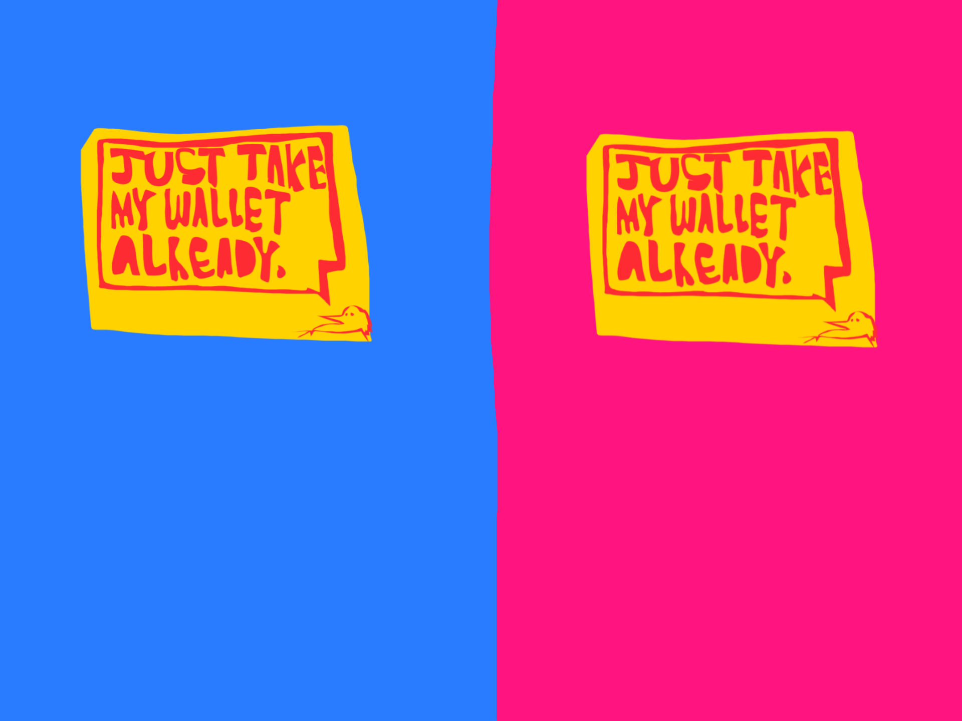
ithink the blue looks cooler in my opinion n easier on the eyes!! (which may not be the motive but :shrug:)
17 Nov, 2022, 1:13 am
Gotta agree with wack.
17 Nov, 2022, 2:08 am
blue has good contrast
17 Nov, 2022, 4:19 am
I liked the pink one, but that's because the more it hurts my eyes the better.
17 Nov, 2022, 11:55 am
@wack- 's right. blue is better. accept it. :gun:
19 Nov, 2022, 3:15 pm
i think pink- only because my eyes went to see it first, but blue looks good