
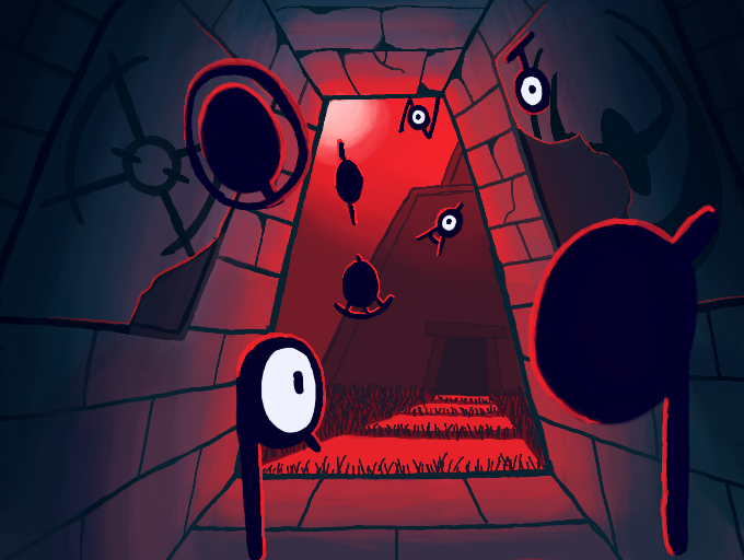
Ruins of Alph by Puzzled
Stairless version because I really didn't like how the stairs turned out. I'm sorry but I think this looks better TuT
#pokemon #unown
Comments
9+
like
reference image
eraser
eyedropper
time taken
nsfw
flip
undo
paint with friends
private
used tools icons
500
100
25
5
1
The comment has been reported
The Colors! Gallery moderators will look at it as soon as possible.
delete comment?
just delete
delete comment and prevent this user from commenting on your paintings
report as inappropriate
confirm
Comments
28 Jun, 2022, 12:21 am
this looks so ominous. i love it!
28 Jun, 2022, 1:07 am
:0 wow even better than before!!!
28 Jun, 2022, 1:16 am
first thank you for complement on the first one and i would have to agree it does look better without the stairs but both are cool
28 Jun, 2022, 1:19 am
The stairless version looks awesome, too. I can totally agree that this one looks better than the one with the stairs. Cool!!!!!!!
28 Jun, 2022, 1:37 am
The stairs weren't necessarily a problem before, but now that you've removed them... It does appear that the picture is more aesthetically pleasing than before. How interesting. I hypothesize that it might be because there is more of a balance between blue to red ratio, or that the increased height of the door diverts more attention to the striking color red.
It may also be because the stairs were improperly shaded? But I do not know for certain, unless I were to study how light reflects on a flight of stairs.
28 Jun, 2022, 7:05 am
This looks so good! The colours work well together that they create a striking atmosphere that's fitting for the ruins
28 Jun, 2022, 9:41 am
@Mazel: Glad you like it! ^u^
@razrdraws: Thanks! (I knew it!) XP
@Kay the pikachu @CyRy1029: Yeah, stairless is better. But, I'm glad you both liked the idea from the original! :D
@Mewsea: Interesting hypotheses! My own guess would be that what was added is more visually appealing then the stairs that were removed. In that case, the stairs were improperly shaded. However, since correlation does not imply causation, I do have to wonder now if the color ratio and door height also played a part in increasing the art's aesthetics.
Also were you always so analytical? O-O
@MentalMinty: Thank you! That means a lot to me and I'm glad you like the drawing ^u^
28 Jun, 2022, 1:15 pm
@Puzzled Me, too. Your drawings are extremly good!!! Sometimes, I wish I was a good Pokemon drawer just like you, among many other creators.
29 Jun, 2022, 2:42 am
@Puzzled I wouldn't have learned what I know about art if I wasn't analytical! ;D I learn most of my stuff through trial and error. Which is why I'm always fascinated by what does and doesn't look appealing.
29 Jun, 2022, 9:41 am
@CyRy1029: Thanks! That's very high praise! I started learning to draw with that same thought and I still think that way. I think every artist feels inferiority about their art. Don't let it get you down. You'll get there eventually, it just takes time and practice. I think your art is build on some great ideas!
@Mewsea: That's right! You learn art by your own means. I know that art techniques like color theory help amplify a drawing, but that never means it's the reason why the art is good. I don't think I've tried to understand why I like a drawing beyond the techniques used. Huh, I'm becoming more and more interested by your learning methodology!
29 Jun, 2022, 2:37 pm
@Puzzled Actually, I think I know what the problem was now... You created a vanishing point for the walls of the ruins, but the staircase didn't follow that point, which made the whole picture seem "off." The shading was fine, however.
Buuut... The large amount of red still could've played a role in making this piece look nicer... Still not sure about that, however.
01 Jul, 2022, 1:41 am
@Mewsea: That does seem true. The area where the wall and stairs meet looks like are noticably off-putting. They should be heading to the same direction but they are not. I think the stairs also lacked details that the rest of the drawing had. Maybe if I had added that, my staircase would have better connected with the rest of the artwork.
Thanks for being my second pair of eyes on this; your input has been very valuable!!! I might want to post some of my wips to get your opinion for improvements XP
01 Jul, 2022, 4:25 am
Sure! Glad I could help! And I wouldn't mind being your second pair of eyes if you'll be mine. There's things that you can see that even I cannot, at my current level of skill.
02 Jul, 2022, 8:23 am
@Mewsea: Of course! ^u^
15 Aug, 2022, 6:58 pm
Man I miss out on so many awesome pictures you done!!!
Fantastic work on all of these!!
17 Aug, 2022, 9:18 am
@ShadowPikaboo: Thank you so much!!! I'm really glad you enjoyed them! You're very kind ^u^