
TB Decided by -Vero-
@TB_Studios , I tried...
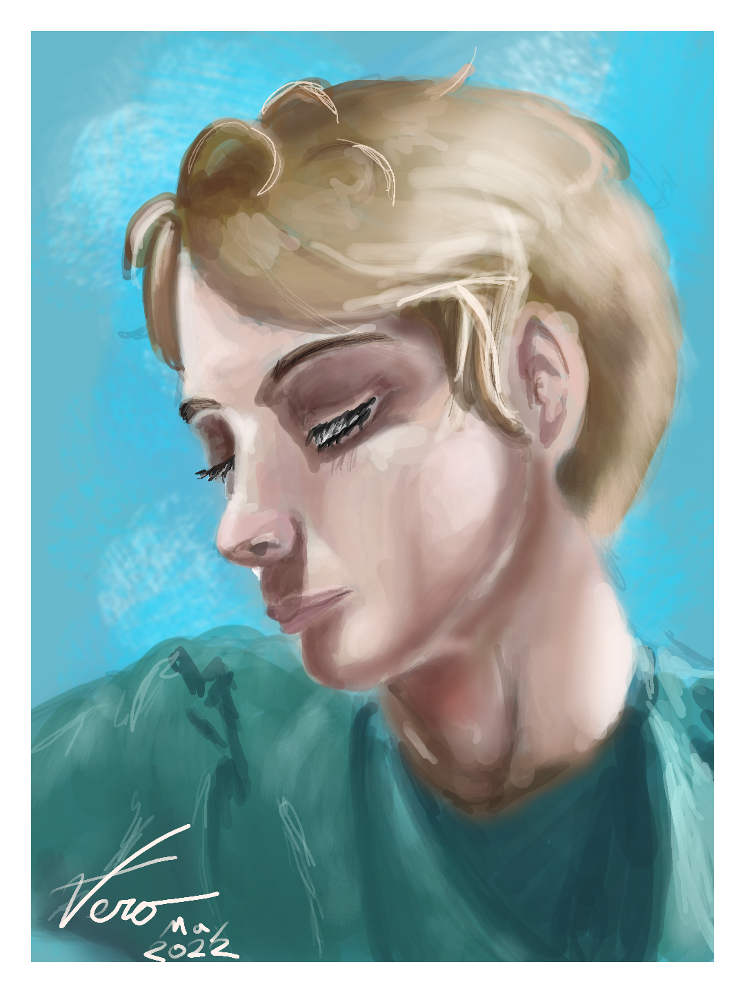
This is more than less my first realism attempt.
Not completely happy with it, but I'm unsure how to salvage it...
#RDcontest #rdfb
Since there's an extra week, I might try fixing it up...
Comments
9+
like
reference image
eraser
eyedropper
time taken
nsfw
flip
undo
paint with friends
private
used tools icons
500
100
25
5
1
The comment has been reported
The Colors! Gallery moderators will look at it as soon as possible.
delete comment?
just delete
delete comment and prevent this user from commenting on your paintings
report as inappropriate
confirm
Comments
01 Jun, 2022, 4:12 am
LMAO nice hair! XDDD
way better than my attempts at realism!! XDDD
01 Jun, 2022, 12:14 pm
I think it is really good!!!! Especially since you chose a difficult pose! I always struggle with tilted heads, somehow they alway end up straight or looking like a fish :/
01 Jun, 2022, 4:12 pm
Bruh not bad at all! Well done! The aproach you took on your refrance was impressive, the posision of your lighting to shading is pretty on point, with what you had to work with from the instructions I gave you, and the time put into it, you did veeerrrry well :)
01 Jun, 2022, 4:14 pm
realism portraits can be a beautiful thing, you are good with them, keep it up! :)
01 Jun, 2022, 6:53 pm
u dOnT fOoL uS @TB_studios , We aLl kNoW yoUr a PlaNt iRl! XDDD
01 Jun, 2022, 7:34 pm
IT'S TRUE!! Lol xD
02 Jun, 2022, 3:25 am
@Lydi073 @Pastrys_N_Milk @Duck01lover & @TB_studios
Thank you all. You all are making me feel a lot better about this.
@Lydi073 & @TB_studios
Shoot! If I had known he was a plant, this would have been so much easier!
02 Jun, 2022, 4:40 am
yeah, but ur forgetting,that hes a plant with a denim jacket and sunglasses!
one MUSTN'T forget the jacket and glasses! it simply will not do! LOL XDDD
02 Jun, 2022, 5:13 pm
Hahaha!!
02 Jun, 2022, 7:14 pm
@Lydi073 @TB_studios
What?!
Good thing you told me! I wouldn't have known. I would have gotten him all wrong!!
...I kinda want to draw this now though...
02 Jun, 2022, 10:29 pm
@-Vero- on my old account i did actually! u should, it was great fun! LOL XD
02 Jun, 2022, 11:43 pm
@Lydi073
I just might!
06 Jun, 2022, 8:10 pm
Glad that you are trying realism! I will wait until after the contest to give the feedback, but glad you are using the tag.
08 Jun, 2022, 1:44 am
Thank you @tall73 !
I'm looking forward to hearing what you have to say!
14 Jun, 2022, 10:38 am
how... just HOW did I miss this????
suspension's doing wonders for my social life..
14 Jun, 2022, 10:01 pm
@razrdraws
I get it. It feels like I stay away from something for 1 day, and feels like I missed so many things! -But hey, it's not always bad! Sometimes it's better that way, and sometimes one might even miss something one never really wants to be a part of!
14 Aug, 2022, 1:50 am
@-Vero-
@TB_studios
Wow talk about being away and missing things. I never gave the feedback!
You mentioned this is your first realism attempt. It is quite good! You definitely got the notion of conveying shadows, 3d form, and you took on a challenging pose that is not quite profile, or 3/4, and it reads fine. The proportions and placement of features seems pretty good, and as others noted, you have a tilt to the head, which adds to the difficulty. And you did it in a timely fasion.
You suggested clumps of hair without drawing each hair, included the reflected light along the jaw line, etc. which all add to the image. Since this is very strong for a first attempt I am going to give some suggestions that might help elevate it from here, at least in my view. And in this case you could add them over the top of the existing image in a new version to try it out, whether you ever publish it or not.
1. There are not a lot of highlights. I struggle with this too and @madwarms reminds me that once you have the hard work of putting in your shadows, mid tones, and lighter areas the highlights are the fun part that makes it pop.
2. Using one primary tone for the skin will often not convey a believable skin tone, especially if the lighting is not very harsh. In harsh lighting you may get very stark lights and darks, but here you have more diffused light, and you need something more going on to hold interest. Blending some various tones can be more convincing.
One thing that some portrait artists do to get a start on blending of various tones is to use three tones on certain "zones" of the face.
James Gurney explains the concept here, and gives examples:
http://gurneyjourney.blogspot.com/2008/05/color-zones-of-face.html
Starting with a mix of tones in this way, including some cooler and some warmer, then leads you to a more nuanced skin tone overall.
3 . The shirt color and the background clash a bit with each other. They either need to blend more together with a overlapping of forms, sinking back with the face as the primary focus, or have enough difference to set them apart, in my view.
Another thing that could help with this is to repeat colors throughout the painting. So since you have a bit of warmer reddish tone in the face in the shadow areas you could repeat some of that in the green to tie it together.
Using the facial zones we talked about earlier the face could have a bit of the green, more muted, from the shirt, to also tie those together, etc. The hair, instead of having a darker hue of the same color could have a bit of the red shadow element as well. And if you are going to have the blue background, you could include some blue, cool, light to contrast with the warmer shadows. You see a bit of that effect in the green shirt, mainly because you used a lighter shade of the green for the light areas there.
In any case, sorry for the extreme delay in your feedback, and I am glad you requested feedback using the #rdfb tag. Enjoyed the painting and watching the process.
14 Aug, 2022, 1:58 am
Another thing I noticed, the most saturated part of the whole painting is the area on the neck. Unless you want that to be the focus of the painting you need to moderate that and put some saturation elsewhere to draw the eye.
13 Sep, 2022, 6:56 pm
@tall73
Thank you very much! I will keep all of this in mind!