
Landscape Tips by tall73
This thread is to share tips about landscapes! Feel free to chime in.
To start us off, landscapes can achieve distance by the following:
1. There is more contrast in the foreground than in the background. As you get further away in the painting things are less dark, and less light. Up close you see more dark and light together. You can modifiy this intentionally if you want to put more focus on the midground, etc. by putting less contrast in the foreground, and making almost of a camera-focus or "bokeh" effect, where only one part is in sharp focus.
2. Certain colors tend to drop out in the background. This atmospheric effect means that warmer colors tend to be less prominent in the distance. Yellow and red, etc. start to drop out further back. Shart to shift your tones to more cool colors. Hence, you often see bluish or purpleish mountains in the background.
3. Things get smaller in the background.
#landscape #tutorial #landscapetips #talltips #tallstips
The comment has been reported
The Colors! Gallery moderators will look at it as soon as possible.
Comments
02 Mar, 2022, 7:38 pm
4. Colors get less saturated, or closer to grey, as you move to the distance. You can also draw attention to particular items in a painting by increasing saturation, but be careful of doing this for objects in the background as it will look out of place and bring it forward.
If you paint something in the distance and it doesn't look far enough back, try putting a thin (transparent) layer of grey over the top, and then using the eraser at a transparent setting to blend it all in. This can push back the background some.
You don't have to use grey either, you can just use a desaturated, less vibrant, version of the color you have in the background.
02 Mar, 2022, 7:40 pm
A tip to remember if you are using switch or pc is that you can use the layer transparency option to your advantage. If you finish a painting and it looks darker than you would like, try making a new layer underneath and putting a bright color. Then place your painting layer on top and slightly adjust the transparency. This is like using an underpainting in traditional painting, but you can do it after the fact!
02 Mar, 2022, 7:52 pm
Keep in mind relative values. In many cases the values in a painting go from darkest to lightest based on how much light from the sky gets through, even before you account for all of your shadows:
sky-lightest
ground-light
slanted objects (mountains or hills, etc.)- less light
standing objects (people, trees, buildings, etc.)-darker
For more information check out this short video where he demonstrates 4 simple landscapes.
https://www.youtube.com/watch?v=CyCWh36xXSg
02 Mar, 2022, 7:57 pm
I'd also add: using softer lines/edges in the background can amplify the distant effect too.
02 Mar, 2022, 8:00 pm
@mcollins Good point! Harder edges diminish in the haze of distance!
02 Mar, 2022, 8:04 pm
In sunlit areas lighter areas tend to use warmer colors (yellow, orange, etc.) and shadows tend to be relatively cooler. That doesn't necessarily meen you need purple or blue shadows, but you want to go along the color wheel to something relatively cooler.
So if you have yellow light, your shadow might be closer to red, etc.
02 Mar, 2022, 8:08 pm
The pixel tool allows you to use tricks to get correct proportions. If you are working from a photo it can help to break it into grids. You can then use your pixel tool to make a grid as well in colors for that initial sketch or lay-in so that you can make sure they match up. Just remember to put it in a different layer so you can delete it after!
02 Mar, 2022, 8:16 pm
Use the biggest brush you can for a given task, especially early in the painting. This helps you get large elements before going to details. If you are adding something important then start a new layer, and if you go beyond where you intended use the eraser to trim it back.
02 Mar, 2022, 8:20 pm
You don't need to draw every blade of grass (though sometimes in the foreground you might), but you can suggest it by a variety of colors, and some changes in texture.
As you get further back less texture is needed.
02 Mar, 2022, 9:28 pm
One of my favorite ways to use ref to study is to first do one based directly on a photo, then do additional studies afterward where I rearrange those same elements or show the same scene from a different angle. Makes it so I have to mentally break down the scene.
02 Mar, 2022, 9:34 pm
@Smallpoly Good tip! Sometimes just changing the lighting from the original photo is a challenge.
And I would urge folks to think about composition. You don't have to paint everything in a photo, just because it is there. And that kind of experiment with changing things up is really helpful. I would also encourage people to take their reference photo and then think about changes before they even start painting, and make them to the photo itself.
Would the scene be better cropped a different way? Could you go into a photo editing program and tweak the lighting to your liking? Do that first, then paint it.
I often modify my reference considerably before starting a painting. Sometimes it is easier to see what you want it to be in the photo first where the values and form are already correct.
02 Mar, 2022, 9:36 pm
By the way, if you folks are not following @Smallpoly yet, you should! He has some fascinating, and at times very quick work. And he tends to follow correct practices more than I do, so you could learn a better way.
02 Mar, 2022, 9:37 pm
And if you want to talk to folks like @Twarda @Acchan @Madwurmz , etc. they stop in at the Realism discussion thread on Colors discord, so stop by if you can!
02 Mar, 2022, 9:47 pm
For those of you who can draw well, but can't quite seem to make a scene work right, check out this channel on composition. Or even if you don't draw well, composition can often make simple paintings work anyway.
https://www.youtube.com/c/IanRobertsMasteringComposition/videos
He goes through a ton of concepts on how to think through composition, simplifying, and making your paintings read well, and highlight your point of interest. He will discuss seeing shapes instead of things, which is very important for painting, and how to do "abstraction".
Watching several of his videos one day will help you to star thinking about the bigure picture in painting.
02 Mar, 2022, 9:51 pm
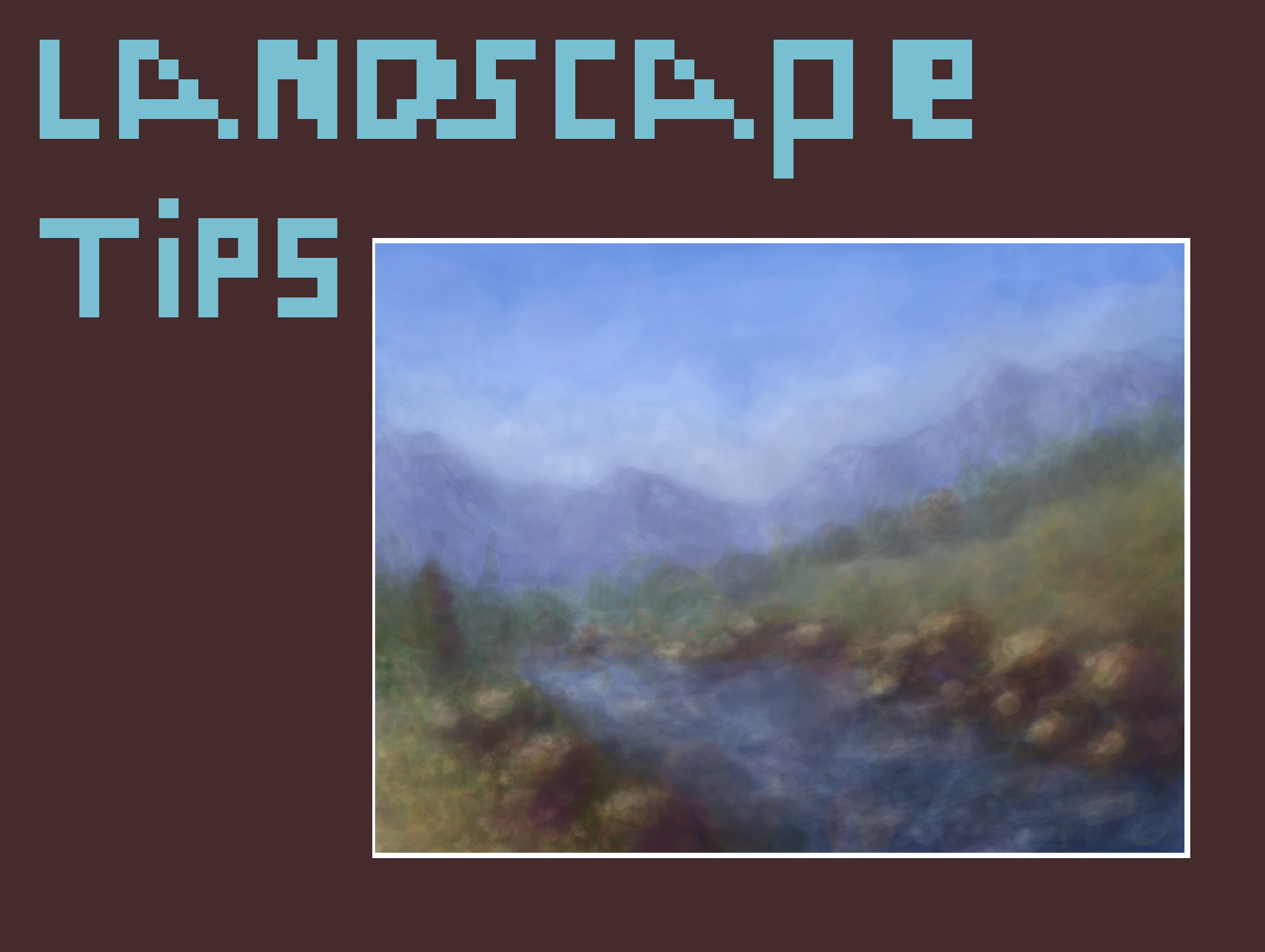
One thing to avoid (which I failed at on the left side of the river bank here) is placing items in nature in straight, evenly-spaced lines. Nature rarely lines up evenly.
That is also why it is helpful to pause once you have your general lay-out to look over things from a distance. When I was painting this (some time ago), I was so caught up in putting little rocks in there in between big rocks that I didn't take time to look at the overall composition. That negatively impacts the final piece.
02 Mar, 2022, 10:28 pm
Another option for greying down sections if you do it right is to glaze complimentary colors.
02 Mar, 2022, 10:57 pm
Great advice! Awesome painting! I'm not great at backgrounds lol XD
Re: Thank you for your comment btw ^ ^
02 Mar, 2022, 11:36 pm
Featured tutorial in 3 hrs. (I think it was three)
02 Mar, 2022, 11:39 pm
ok :) and also dont forget good posture while sitting and take breaks often , have good sleep and don't eat sugar :)
02 Mar, 2022, 11:51 pm
@madwurmz.com Hahaha! Listen to this man! lol
03 Mar, 2022, 12:27 am
@madwurmz But... sugar is GOOD!
03 Mar, 2022, 3:28 am
These are all super helpful tips, thank you for posting these! :0 I struggle with landscapes sometimes so these'll definitely help me out haha xD
03 Mar, 2022, 4:07 am
@Lydi072 @-Vivie- @DreamCloud Hope they help, have fun doing landscapes!
03 Mar, 2022, 5:56 am
This is very imformative, thank u for the tips!!
04 Apr, 2022, 3:32 am
When I do backgrounds, I decide beforehand whether it is going to be warmer colors or cooler colors. (ex. my two tommato paintings)
05 May, 2022, 8:09 am
@razrdraws sugar in fruit contain balanced ingredients to counter the sugar effect.
but the sugar effect is a problem, sugar from candy will mess up your energy levels, not good for our health. I'm supporter of higher sugar tax.
28 Dec, 2022, 9:28 pm
i have question
28 Dec, 2022, 9:28 pm
can you see if my backgrounds look good?????
29 Dec, 2022, 5:18 pm
@sor22335 So far the backgrounds look fine, if a bit basic. Are you wanting to try a landscape?
30 Dec, 2022, 2:35 am
idk lol