
ref by Stalker Blade
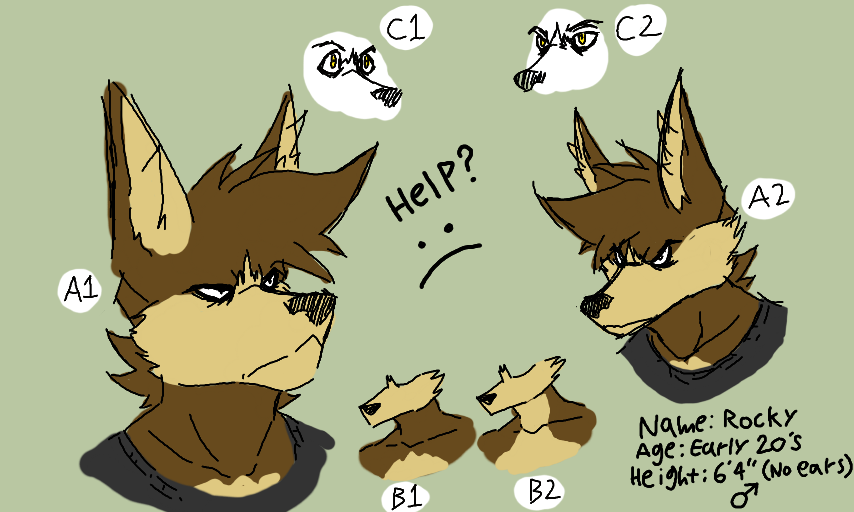
I need your opinions. This very post will change how I portray my most valuable character from now on, so it's very important. I want you to comment which labled designs you like the most. His design is something I've had problems deciding on for years and it's time to fix it.
Comments
9+
like
reference image
eraser
eyedropper
time taken
nsfw
flip
undo
paint with friends
private
used tools icons
500
100
25
5
1
The comment has been reported
The Colors! Gallery moderators will look at it as soon as possible.
delete comment?
just delete
delete comment and prevent this user from commenting on your paintings
report as inappropriate
confirm
Comments
21 Mar, 2020, 2:55 am
personally, i like kinda like AI, B2 and C2. He actually looks a little more like his design source; a wolf. It also makes him appear more serious, which fits his personality. B2 would be closer to a real wolf pattern and could help his neck be more visible, but it kind of looks..odd...to me, anyway.
21 Mar, 2020, 2:57 am
Slightly re-designing a character you've been attached to for almost a decade is hard...
21 Mar, 2020, 3:35 am
you and i apparently have similar taste because AI & C2 are what i prefer/vote for. i like BI more though. (probably cause it's what rocky's had for ages)
not sure what it is about B2 that's off... maybe the cream/yellow (idk lol) bit on his throat should be thinner? or wider?
it's good to see rocky on here again :^) i cant remember when you last posted a thing of him. a few years i think?
21 Mar, 2020, 6:28 am
^ I completely f.ucked that up actually, my bad...I meant A2, BI and C2...
I think you might like AI more because it's similar to how I used to draw his face. I find A2 to be easier to draw while AI is actually pretty annoying to get right. I agree about BI though; I'll probably stick with it.
21 Mar, 2020, 12:03 pm
I kinda prefer A1, something about the chunkier muzzle shape I think looks cool. Though if you're aiming for him to look more like a wolf, then yeah, A2 might be better.
For the neck patterns, B2 looks slightly off (I can't put my finger on why) and B1 is what I'm used to, so I'd choose that.
Aaaand probably C2.
21 Mar, 2020, 6:15 pm
Looking at these, I do like A2, BI and C2. The seriousness of the "A", the cream detail up to his neck in "B" and the eye appearance of "C" do interest me [regarding my choices].
Sorry if my imput is sort of lacking. I'm not that competent at critiquing. .-.
22 Mar, 2020, 2:59 am
For me, A1, B1, C2.
I was going to say B2, but then I remembered your other character, Jet (if you still use him), has B2 for his design. I think having B1 for Rocky helps differenciate him more from Jet.
I think A1 allows for more room for expressions. Even though Rocky is generally a serious character, I still like a character that is expressive to some extent. So if you wanted to show Rocky really pissed, I think it helps. Plus I like how the big muzzle looks (and it makes me feel nostalgic since that's how you drew him before lol) so really it's just a personal preference.
But for you, if you think A2 is easier to draw, and you really want to make him look more like a wolf like Radiant Raindragon says, then go with that.
22 Mar, 2020, 9:52 am
A2 B2 C2! :)
22 Mar, 2020, 9:53 am
Those draw my attention!
23 Mar, 2020, 7:37 am
Re: Sweet. Would love to see how Jet looks like now!
And lol, I'm just excited for New Horizons because I'm big on games that allow for customization and just doing whatever you want. I think it takes itself a little more seriously than it should but almost everything it does is meme-worthy
14 Apr, 2020, 2:54 am
My opinion is invalid but like I personally like A1 B1 and C2