
Amouri redesign (for the 53533th time) by FruitPalmTree
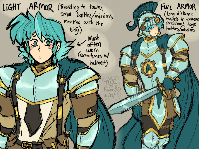
Amouri's design is tricky because I made the mistake of giving him this neon ass aqua hair when first designing him, and then trying to mix brown into his palette. Two colors that... Don't look good together at all. (No wonder he misses his natural hair color lol, I do too.)
Also I've been thinkin on making his skin paler, because it fits better with the hair.
#reemania #tikkiocs #howmanyredesigns
Comments
5
like
reference image
eraser
eyedropper
time taken
nsfw
flip
undo
paint with friends
private
used tools icons
500
100
25
5
1
The comment has been reported
The Colors! Gallery moderators will look at it as soon as possible.
delete comment?
just delete
delete comment and prevent this user from commenting on your paintings
report as inappropriate
confirm
Comments
14 Nov, 2019, 2:46 am
I hate drawing steampunk. Steampunk looks cool, but attempting to actually draw it enrages me.
16 Nov, 2019, 5:35 pm
I don't necessarily think turquoise and brown is a bad mix. Not every shades fits together, but it can work!! :')
16 Nov, 2019, 8:02 pm
I guess you're right. I was struggling with his colors so much that I just gave up and googled "blue and brown color palette." XD They actually made it look good together, I just needed to put that in character form.
24 Nov, 2019, 1:02 am
OOH
i actually love both of these and the colors!
to me this palette is alright, nothin wrong with it at all- i find it appealing, even.
the only thing i can see being eh with it is the fully armored one has a loott of blue which can make the blue seem to be a bit much.
youve got more blue armor visible than with the light armor, and amouri has his predominently blue helmet on in the full armor illustration which when coupled with his bright (pretty lol) blue hair, it's a lot of blue. and of course then there's the cape itself which is a ton of blue. but-- the cape's a darker blue than the other stuff and has contrast, the light blue helmet and amouri's MagicHair (*shot*) dont have much contrast at all.
tl;dr: i think the issue lies in the helmet. maybe make it a little less blue? put more brown or gold on it?
24 Nov, 2019, 7:19 am
^ Ah, I see. Not real sure which parts of his helmet/armor I should color brown or gold though.