
reference image
eraser
eyedropper
time taken
nsfw
flip
undo
paint with friends
private
used tools icons
500
100
25
5
1
The comment has been reported
The Colors! Gallery moderators will look at it as soon as possible.
delete comment?
just delete
delete comment and prevent this user from commenting on your paintings
report as inappropriate
confirm
Comments
08 Jun, 2010, 3:31 am
I LOVE it!!! Really has that LoTR mood to it. You are a machine aren't you ;)
08 Jun, 2010, 10:34 am
what's this.. a lost concept art for a new hobbit film? awesome.
08 Jun, 2010, 1:04 pm
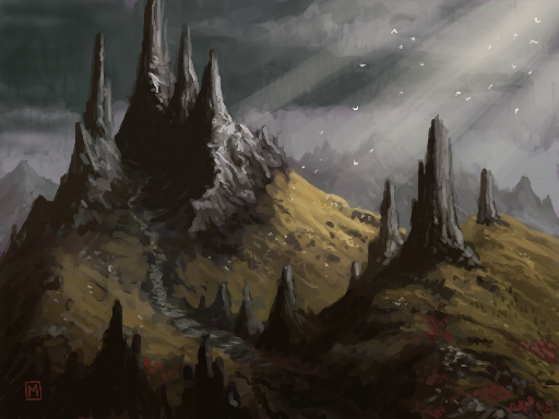
Reminds me of a walk in mountains.
The mood was so similar to the pictures.
Heavy, gray sky, some sun rays hitting the brownish ground and falling snowflakes sparkling through the air.
I really have to learn how to paint seriously.
08 Jun, 2010, 7:35 pm
@Vyse: I need to learn to paint seriously too. I just dick around mostly and have fun! o/
09 Jun, 2010, 10:46 am
It's also fun looking at your playbacks.
For me, that is serious painting... because, only if you know how to paint, it starts to make more and more fun.
May I ask you a question about the idea behind the background color you sometimes start with?
Here (or in your "Shrine" painting") its purple.
I saw few other painters, who start with such color, that doesn't seem to fit the enviroment at all.
09 Jun, 2010, 1:34 pm
Sorry. I guess saying I "dick around" is generally my being self deprecating. I do take art seriously... sometimes; but I'm usually at my happiest, and producing better work, when I am care free and don't have an agenda. The purple canvas is just me experimenting. My usual palette is slightly mute so I've been throwing down a more warmer, saturated canvas to work over as a way of gauging my tones. It's becoming more tricky on my aging DS to pick colours I want. The difference in temperature between what I see on screen and what the actual is on my PC has become rather vast over the past 6 months, so I rely more on learned previous colour picking than anything else. I can't really go into it here, but I've found the blues, greens and yellows are effected more on my screen so I tend to pick purples and reds as a reliable base. Beyond that, I enjoy working cool, lower saturation colours over warm. I do so often in Photoshop.
12 Jun, 2010, 10:51 am
At first I thought this was a "Serio" picture using "Munins" color palette, due to the spiky strutures that I related to Serio. Very, very nice!
12 Jun, 2010, 1:07 pm
Splotch -haha lol. I wish to draw with such excellence like Munin but it is a long way before me to produce such stunning pieces. But thx for compliment :)
13 Jun, 2010, 3:04 pm
hehe... maybe Serio's spikes have pierced my subconscious. :D