
reference image
eraser
eyedropper
time taken
nsfw
flip
undo
paint with friends
private
used tools icons
500
100
25
5
1
The comment has been reported
The Colors! Gallery moderators will look at it as soon as possible.
delete comment?
just delete
delete comment and prevent this user from commenting on your paintings
report as inappropriate
confirm
Comments
30 Jan, 2018, 10:33 am
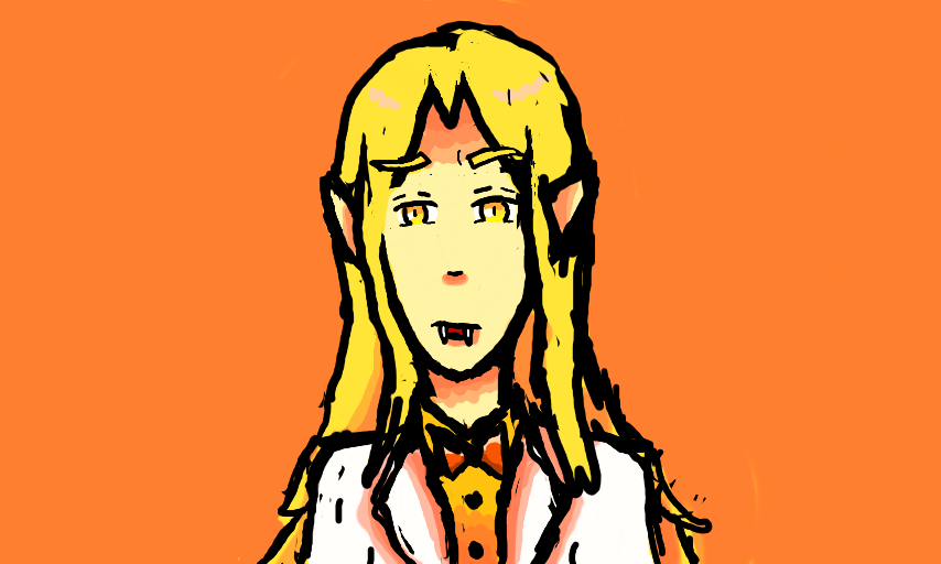
He looks sad RIP
31 Jan, 2018, 5:29 am
^ he's a sorta sad person so that's actually fine :P
orange backgrounds fit him so well w.tf I THOUGHT GOLD (or blue) WAS HIS COLOR BUT I APPARENTLY THOUGHT WRONG
31 Jan, 2018, 5:34 am
also thank you for this, i love how this looks colored :'^)
i should make a kattfav type tag for stuff that i didnt make, id want this in it lol
i wish i could put tags on things i didnt make, itd be awesome if colors had a thing like youtube playlists where you could make a "tag" and put a bunch of your favorite pics (that you didnt make) in it. ...dA probably has something like that.
collecting smiles pls add
31 Jan, 2018, 5:52 am
I always tend to put gold with warmer colors, like orange and peachy tones. Idk why its just SO PLEASING TO MY EYES.
Then again, orange is my favoritw color so.. X,D
31 Jan, 2018, 5:54 am
I was noticing that you used a lot of duller colors in your art for him (usually a grey background) so after i finished this i was like "well, shit. I didn't do a good.." but i liked how it turned out so a kept it. <_>
Its really great to see that you like it too, i figured itd help you feel a little better if i finished him. :>
31 Jan, 2018, 6:18 am
Im SO glad i changed the eyes though, the shape i had for them --while mildly trying to copy Wright pones eye shape-- was kinda goofy and didnt really suit him.