
she purdy by Krazy Katt111
#idrewusomethin#unfinishedjunk
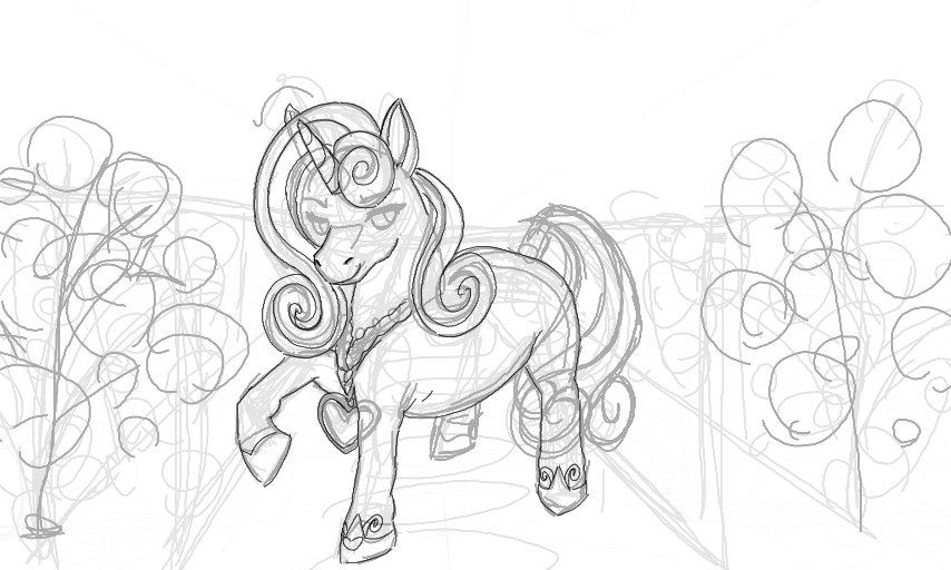
Not liking this much. Not sure what it is that I'm disliking, but something's not to my liking. I'll probably redraw it.
I think I'll be slower on this compared to the other AT halves since I'm losing my spark. Again haha.
I either "have it" or I don't, most of the time I don't. Hence the ATs' higher quality compared to my usual "f**k it, this will do" posts.
Comments
5
like
reference image
eraser
eyedropper
time taken
nsfw
flip
undo
paint with friends
private
used tools icons
500
100
25
5
1
The comment has been reported
The Colors! Gallery moderators will look at it as soon as possible.
delete comment?
just delete
delete comment and prevent this user from commenting on your paintings
report as inappropriate
confirm
Comments
19 Jun, 2017, 6:23 am
Welp, after posting this, one thing that now stands out is those eyes. They're way too big and are out of proportion as a result.
19 Jun, 2017, 6:27 am
...The "camera" angle is also off, point of horizon is high up and the view of velvet doesn't match up with things.
Don't draw while tired, folks. Or this happens.
19 Jun, 2017, 7:26 am
fhitsjouymgn I'm actually not too displeased with the picture now lmao I'd been working on it all day and it was 2:30 am by the time i'd finished it so i was tired I think
i'd actually gone back and dimmed the colours from the wip and cel shaded it all with greyish tones and used the original base colour as the highlights then brought back some orange and yellow tones to creat the feel of fire but i think i just went too yellow and thats what bothered me
like you said don't draw while tired lol
19 Jun, 2017, 7:41 am
Also working with greys and off tones is hard for me due to a processing disorder cause my brain just goes NO WRONG and i see colours as either brighter or duller depending on how my brain is processing so sometimes things come out really dull or really bright just cause my brain is being sh.it
20 Jun, 2017, 5:15 am
Really cool! :3