
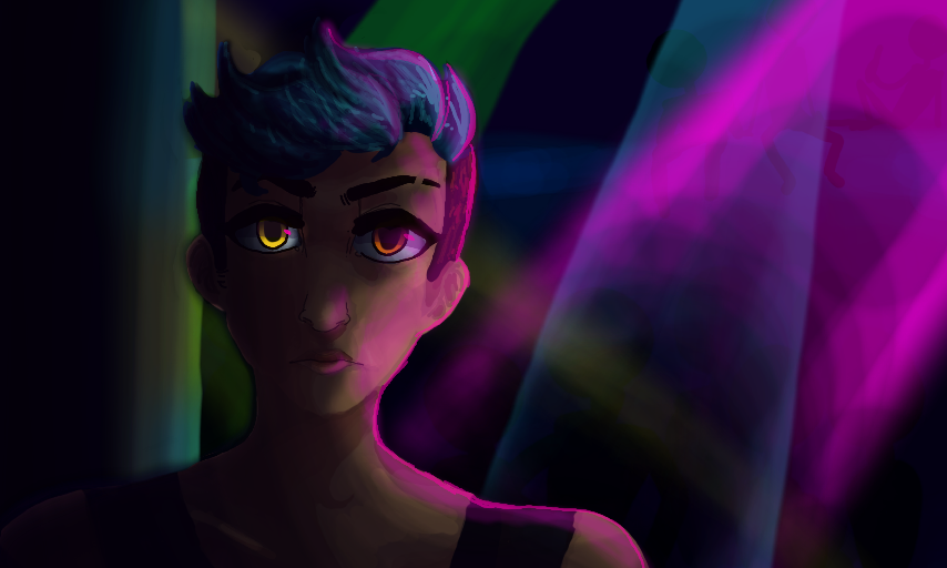
ughhhh by apricity
point me in a good direction so I don't suck at digital painting
what has Kyle even become
I tried to do the pink light effect that insomniverse did
uh no
I can't draw lights
so many talented digital painters
I hate this
Comments
5
like
reference image
eraser
eyedropper
time taken
nsfw
flip
undo
paint with friends
private
used tools icons
500
100
25
5
1
The comment has been reported
The Colors! Gallery moderators will look at it as soon as possible.
delete comment?
just delete
delete comment and prevent this user from commenting on your paintings
report as inappropriate
confirm
Comments
26 May, 2017, 1:25 am
Dude I love your art!
And your digital art is incredible!
I've been drawing on my DS for more than three years, and I'm just now getting the hang of it, especially shading.
26 May, 2017, 6:08 am
Try using a low opacity brush of the airbrush or the stroky one instead of the flat brush maybe, I use a combo of those two for light rays! After you do the light color you can go back and eyedrop your background color and low opacity brush back over the light to fade it more too :D This looks really cool though!
26 May, 2017, 7:36 pm
Which pic did you reference? I could help you out if you'd like! (also sorry for the delay in critiquing your stuff, I should have something by tonight!)
28 May, 2017, 8:34 am
Re;
Alright, critique #2! AKA: Actual Art Advice (tm)
Ok so, something that I saw you've been kinda struggling with lately is the difference between hard lighting and soft lighting. In your blue dragon piece, you rendered using only hard shadows whereas in this piece, you've only used soft shading. With any piece (although it's definitely subjective), it's necessary to have a balance between the two. Personally what I like to do is keep the hard brush at 50-70% opacity and color-pick gradients where I feel there should be a soft transition. I dunno how to explain that any better, so feel free to check out #insomtutorials or watch any of my playbacks for clarity lol.
ANYWAYS, the reason why you need to have a balance of hard shadows and soft shadows is because they directly CONTRAST with each other. Without contrast, things lose a key component of visual interest and start to look flat. This can be applied to any element in art. In your case, I'd say another thing you'd benefit from is learning more about values.
Values are the absolute most important thing in paintings. Without strong values, paintings start to get confusing and unpleasant to look at. Color definitely helps add a lil something to a painting, but without a clear understanding of values, the painting will fall apart. Values help the viewer distinguish each element in the painting. If you can't tell what's happening in a painting from afar, you need to work on the values more. Clarifying your values can be as simple as just putting a light tone next to a dark one for contrast. with this piece, I feel like you can solve a lot of your frustrations by simply putting a rim light around the left side of the subject. Bam, contrast AND clarity.
29 May, 2017, 4:19 am
Whoops forgot to add resources
1. JohnofTheNorth's deviantart tutorials (good for values/shape/color etc. This guy's one of my FAV teachers.)
2. Anthony Jones' youtube videos (VERY good for values and shading help. Just watch a few livestreams and dig through his early videos)
3. Sinix's youtube videos (also super good with values, as well as super clear with his explanations)
4. drawabox dot com (just good for general tips such)
5. Noah Bradley youtube videos (He has videos on pretty much eveything lol)