The Standoff by Gary!

I definitely need more practice with Backgrounds, but I guess this is fine.

#mech
#mecha
#robot
#scifi
#future

Comments
9
share
like
used tools icons

painting stats

painted on a Nintendo 3DS
06 Feb, 2017, 7:28 am
08:35

Comments

HolyPandaz

06 Feb, 2017, 7:32 am

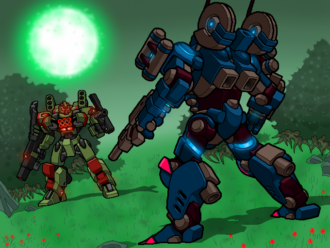
Friggen amazing! I love that blazing green sun or whatever it is! The robots look super amazing as well! Love that bright pink on the blue one XD

FadingGlory

06 Feb, 2017, 12:40 pm

Dang, this turned out amazing!! I love the perspective, lighting, atmosphere, and everything! The glowing effect of the moon gives this an especially ominous feel. Great job!!

Mr.Doodles

06 Feb, 2017, 1:57 pm

You put flowers about the field... Not an overbaring amount either... It's like the garnish on the plate at a resteraunt: though it's not the focus it ties the dish together. The gradient fade into the horizon. The background leaves nothing wanting, neither is it too simple nor does it assault my senses. My one criticism is the lighting and source of lighting. I don't understand the shadows in comparison to the green sun :p

Tempo613

06 Feb, 2017, 4:14 pm

Now those are some bada-- looking mechs. I LOVE the designs, especially the green one, that thing looks like it's ready to do some nasty business. The one on the right kinda strikes me ass a "sports car" equivalent to mechs, not so well armed, but d-mn fast. I LOVE how much your designs remind me of Armored Core. They have a fusion of Japanese and American mech styles.
My one complaint regarding the mechs is the GARISH pink color on the right one's knees and toes. But that's it, otherwise they look just wonderful. Every line seems to be perfect, as does the choice of colors, barring the above mentioned.

The background is nicely put together too, that moon or sun, star whatever is just icing on the cake here. With the way the mechs are posed and just the whole situation, it gives the impression they're doing an old-west scene, meeting at sunset for a showdown. Except with mechs and on an alien planet. I like how their is stuff in the background, stones, flowers, yada-yada but not too much. Decorative, but not busy. It's easy on the eyes.

Although, barring the star, I think you should have detailed it more. The overall style it's done in kinda clashes with the mechs. It honestly looks like they were drawn separately by different people and them combined. Your style of both people and mechs have clear, bold, dark lines and sharp shadows and angles, really giving your style a unique look and feel all your own and bringing it to life. The background has NONE of that. It's blurry, lineless, and rather lifeless. It looks like you lost interest more than anything. Maybe add some lines to define everything a bit more?

Okay, as usual, the shading is wonderful... But where exactly is the light source? Those shadows don't match up at all with the only thing in the whole painting that looks like a light source, it makes it look like the star, landscape and both mechs all exist on a different plain, not relating to eachother at all and just sort of copy-pasted into an image together.
Sorry if I sound like an A-hole, but I'm absolutely convinced you can do better, and would really like to see someone with your talent and skill push as far as they can. Especially since you say you want to be a game designer.

Tempo613

07 Feb, 2017, 2:02 am

Re:
Ah. Yeah, Colors! strangely screws up some colors. XD

Good luck. I loo forward to the next one!

Also, I can't believe you actually read that, wow. XD

irontrident00

07 Feb, 2017, 6:09 am

Cool.

Mr.Doodles

07 Feb, 2017, 12:51 pm

Re: It is cool, don't get me wrong. The lighting is just messing with my head XD

malarkey

10 Feb, 2017, 8:56 am

literally how--

ratgirldingus

12 Feb, 2017, 9:31 pm

8 friggin' hours?

Please login to leave comments

delete comment?

just delete
delete comment and prevent this user from commenting on your paintings
report as inappropriate

English

Japanese