
reference image
eraser
eyedropper
time taken
nsfw
flip
undo
paint with friends
private
used tools icons
500
100
25
5
1
The comment has been reported
The Colors! Gallery moderators will look at it as soon as possible.
delete comment?
just delete
delete comment and prevent this user from commenting on your paintings
report as inappropriate
confirm
Comments
06 Nov, 2016, 3:50 pm
Poyo check out @SkylosArt she did a drawing for ya! :D
24 Nov, 2016, 6:18 pm
Hey, uh, I have seen your art on here for quite some while, and I have apparently noticed quite a few repetitive details involving your art. You may call me mean for saying these, but this is more constructive criticism than anything else.
Honestly all of your characters seem to have backstories that are...A bit too unrealistic and a bit much. When you give them backstories you tend to hit the negatives way too hard, and the positives on occasions seem a bit too (I'm reluctant to say this, but) mary-sue like. You also tend to use a lot of typical "Red and black = evil" sort of thing. Even when you use those colors in it, you tend to use a lot of other colors which makes it more of a non-scary sort of thing and tends to ruin the mood sometimes of what you seem to be going for. As in, neon colors and rainbows. Those are a bit eye straining at some points. It's suggested to tone it down just slightly. I get that, for some, rainbows are eye pleasing. But it can easily be seen as something that's just to gain attention to the drawing in a cheap way. Rainbows also tend to be a bit repetitive after a few times.
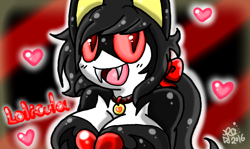
I also noticed how you add a lot of, how you say, "sparkly/shiny effects". Theres nothing truly wrong with them, honestly, it's a big part of your style when it comes to highlights. But in some drawings you tend to put a little too much. I get that shiny highlights tend to be part of your style, but what really tends to be a bit much is when those kinds of effects are splattered literally all over the canvas. This drawing right here doesn't have too much, so personally it is alright.
As for anatomy and lines, as nice as your lining is already, it could use more practice. As in making it more smooth-like. Though, most of it is alright there is a few smaller parts which tend to look slightly wobbly. you should try messing around with lineart to find a way to make it flow smoothly.
I also suggest working a bit on the hands. I understand that it can be hard to draw hands sometimes, but honestly out of all your anatomy it needs the most improvement. You make them look uneven on a few drawings or too long. But knowing you, you can probably overcome that if you try hard enough.
With all the critique being said, I just wanna say more positive things. You honestly seem like a nice person. Your characters' designs are somewhat interesting and your art style is very adorable. Even though it has its flaws, you still have a lot of potential. I'm sorry if I appeared rude at all in this, I just wanted to at least give my honest two cents and suggest what you can work on to improve your art style. I genuinely don't mean any harm.
I wish the best of luck to you and a good day.
24 Nov, 2016, 6:21 pm
PS: I forgot to mention that I am sort of fond of the way you draw eyes. I'm not sure why, but they look nice to me.
10 Dec, 2016, 3:11 am
Okay....I guess....