
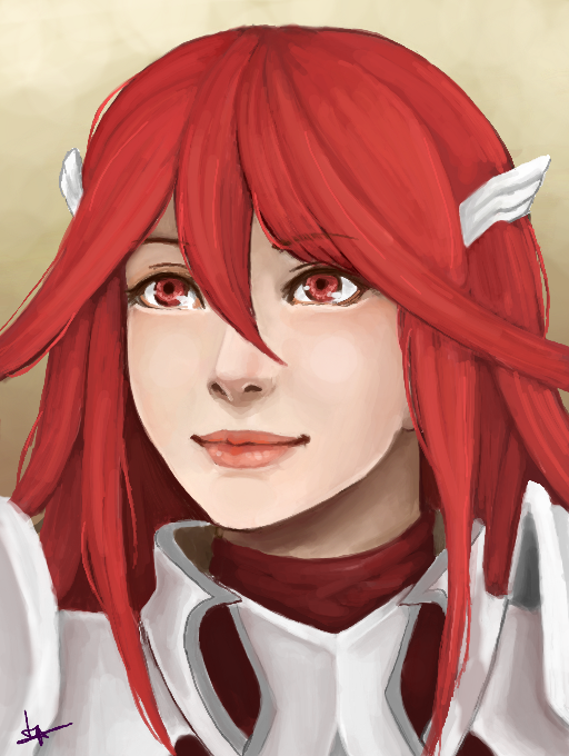
*Remake* Cordelia by Lynarc
Any critiques?
#fireemblem #awakening #cordelia #cmrework #portrait
Comments
9+
like
reference image
eraser
eyedropper
time taken
nsfw
flip
undo
paint with friends
private
used tools icons
500
100
25
5
1
The comment has been reported
The Colors! Gallery moderators will look at it as soon as possible.
delete comment?
just delete
delete comment and prevent this user from commenting on your paintings
report as inappropriate
confirm
Comments
28 Sep, 2016, 10:46 am
Very nice portrait once again!
28 Sep, 2016, 10:47 am
thank you!
28 Sep, 2016, 12:02 pm
Wow! This looks perfect!
28 Sep, 2016, 12:20 pm
Pretty!Otherwise your art trade is available on my gallery ^^
28 Sep, 2016, 1:49 pm
Re:Thank you!^^.Oh okay,take your time(but not too eh)xD
28 Sep, 2016, 5:38 pm
This is so beautiful! I don't have any, critiques to give.
(QwQ great job<3
28 Sep, 2016, 6:02 pm
I don't think there's much that can be said to improve this, as far as critique goes. I suppose her hair feels a little dule. Maybe you could give that a little more shine and depth? Otherwise, this seems about as good as it gets. : )
28 Sep, 2016, 6:29 pm
Ah yes the hair, the most difficult thing for me atm (apart from bodies) :P
Thanks for the feedback! Much appreciated :D
29 Sep, 2016, 12:02 pm
I quite like the way the hair was done. I don't have any suggestions, it's great the way it is
30 Sep, 2016, 5:23 pm
Thanks! :3
14 Oct, 2016, 3:22 pm
Her hair lacks variety in tones, too little shadows & high lights. It may also benefit from a few more loose strands.
The light source is confusing me as well, it looks like it's coming from in front of her face and a tad up (despite the shine in her eyes implying a light source from her lower left & middle right). Yet you see her hair casting little shadow upon her face & other hair pieces. While you can get away with that with soft lighting, the shadow underneath her chin implies a harsher light, as does the shine in her eyes.
Maybe... maybe she just has a soft light all around her? It's very hard to tell, it might just be me.
Regardless of that, I can see how much detail you put into this & it came out beautifully. It's almost all perfect except the hair which has some lumpy shading patches in some places.
15 Oct, 2016, 4:25 pm
Ah thanks! That was a very useful critique. I see what you mean with the lighting.