
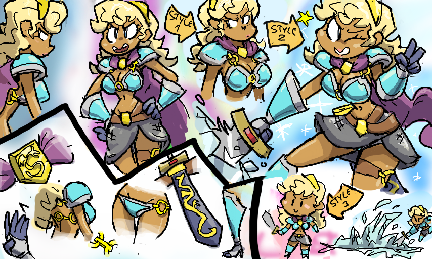
Icy Dragon Warrior Princess! by Whoever
Yet another redesign!... Wait, what? Seriously?
Yep, this is a different design for Aleyda in at least 3 different art styles... What do you think? This design has more thought put into it but it's also... a bit wierder.
A long break killed the CYOA-style comic that starred her. Sorry for never explaining that. I kinda want to pick it back up again but I have too many other ideas right now.
Maybe as a series of shorts?
Comments
8
like
reference image
eraser
eyedropper
time taken
nsfw
flip
undo
paint with friends
private
used tools icons
500
100
25
5
1
The comment has been reported
The Colors! Gallery moderators will look at it as soon as possible.
delete comment?
just delete
delete comment and prevent this user from commenting on your paintings
report as inappropriate
confirm
Comments
18 Sep, 2016, 10:52 pm
Oh neat! Of all the styles presented here, the 2nd one is my favorite! ; )
18 Sep, 2016, 11:45 pm
I tend to like more serious and angry lookin stuff, so I like style 1 the most.
Liking the updated design, I just hope she has something to wear when it's chilly ... or maybe she doesn't get cold, considering the ice powers. :P
19 Sep, 2016, 12:00 am
Always good to have simplified distance models, where details are much less important!
19 Sep, 2016, 12:27 am
@Katt:
Believe it or not I actually have two explanations for that ):D
1. She may be from a fantasy race of humans that lives in both hot and cold climates but is not used to moderate climates. Hence the tan and blond hair.
2. It´s tradition in her culture for warriors of both genders to wear this kind of silly, uncomfortable armor that barely protects anything. It´s seen as a sign of weakness to rely on heavy armor in battle. Her cape may also have some defensive properties, it´s made of Mithril.
19 Sep, 2016, 2:57 am
@Tropeifier:
That´s also the advantage of using cartoonier characters with big heads and exaggerated features. They can emote well even when tiny or far away.
19 Sep, 2016, 3:50 am
I like the upgrade! : ) There's more detail put into it yet it still feels like the same character. Personally I like the style 2 better, though more specifically I like how she's drawn to the left of style 1. Style 3 (chibi) would be good to have around for whenever it's more appropriate.
19 Sep, 2016, 4:59 am
^^^ Very true! Exaggeration is great for clarity. No need to struggle with something too ambiguous confusing the reader.
19 Sep, 2016, 7:32 pm
This design emphasizes the warrior in warrior-princess, where as the previous design has a more princess vibe. This design also has small details, like the the rings holding her armor and the dragon emblem on the cape. I like this redesign.