
vvvv by AlphaGlitch
re-uploading this because I'm requesting a critique on this!! I put a lot of time/effort into it and it's one of my favorite paintings? so I want some constructive criticism so I can make my future paintings better ;v; comment below?? vv
Comments
9+
like
reference image
eraser
eyedropper
time taken
nsfw
flip
undo
paint with friends
private
used tools icons
500
100
25
5
1
The comment has been reported
The Colors! Gallery moderators will look at it as soon as possible.
delete comment?
just delete
delete comment and prevent this user from commenting on your paintings
report as inappropriate
confirm
Comments
14 Aug, 2016, 4:20 am
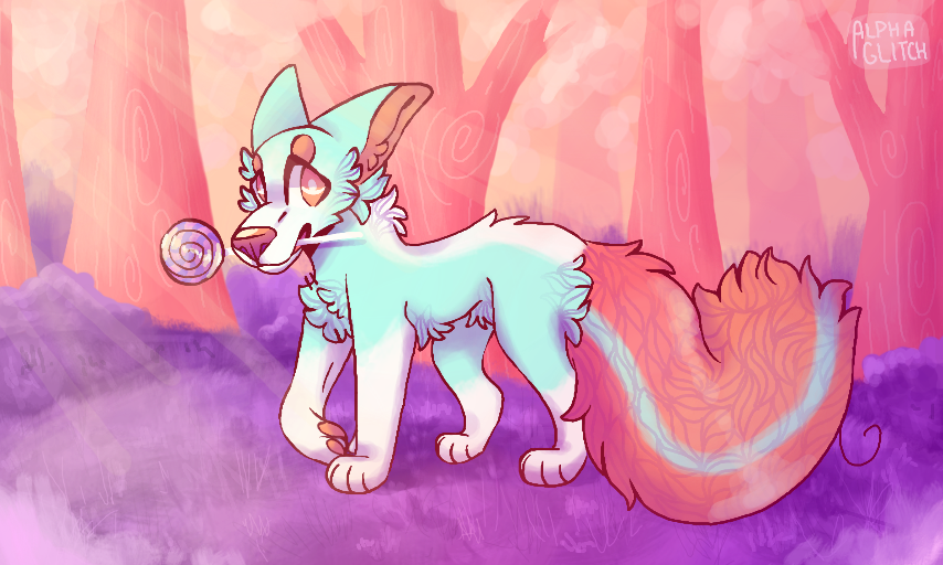
Okay so i never really given a critque but bare with me Imma try here cx. Firstly, I wanna comment on the shading! I seriously love how you shade but in this pic I believe you need a little more shading on your oc. And it needs to be a little harsher(?). For example, I'm guessing the sun is shinging on the right side of your oc, right? You need to shade a little more the the left side (by sides i'm talking the 3d, get me?)
Anyway your antomny (sh-tty spelling from me c':) is pretty good! But the paw on the ride, the one thats bent should be less "stiff" and a little higher than the rest since it's raising it paw a little. But other than that everything is pretty great c:!
14 Aug, 2016, 4:22 am
Btw thanks for ur comment cx
14 Aug, 2016, 4:31 am
http://www.makemegoogly.com/B4C9M perhaps if it looked more like this a bit ?
But I agree with flume. The scenery around him seems to have much more shadowing he does
I feel like he'd fit in a bit more if the shading was equal on him too
14 Aug, 2016, 8:17 am
yeah more shading
and i can hardly see the fluff on its tail but the rest is fine
btw do you take request?
i saw a request pic and that was so great so - if you would do another one could you do #Xanorya maybe? thanx
14 Aug, 2016, 9:37 am
*Deep breath*
I really like the colors in this. I mean purple grass and pink trees! That´s great!
As for critique I can only assume since this is a matter of style and personal preference but ... Okay first of all about the character. It´s in the center of the picture and really stands out bc you drew it with outlines - but everything else not. I think that at least the lolipop - handle? idk the correct eng word o: - should have had some, though! Like this it is hard to see. The character also pops out bc it is the only blue thing in there. About anatomy I just think the tail should be at least on one level with the feet, not below it, bc that makes it look like it was somehow infront of the feet (would look weird from a front view, too I think)
About the background ... you could do better on the trees. I mean some look like awkward pyramids. This is also a matter of style but I think you should maybe look at a tutorial or use a reference next time. The shading also bothers me a bit..
14 Aug, 2016, 9:48 am
... since there is no reflected light anywhere. You should definetly take a look at that (I recommend sycra´s tutorial on reflected light on YT)
Overall I think you should decide on either outlines or no outlines ... like this the caracter seems a bit unnatural in it´s environment. It is great that you shaded it with purple since that integrates it into the environment a bit. You could have drawn some grass blades infront of the feet so it´d look like the character was actually walking though it. With the outlines this would´ve looked weird though I guess.
Also what would have been nice is a foreground! Idk maybe some leaves or so.
Uhh, I hope this helped!
There is certainly more even more to say but I think I covered the main things I (personly) noticed c:
14 Aug, 2016, 7:02 pm
Beautiful colours here! :D
14 Aug, 2016, 7:05 pm
ooh a tip, hmm, maybe try to make the character connect with the background more. Such as the trees shadows on the character or blades of grass covering their feet. c:
15 Aug, 2016, 12:00 am
I really enjoy this picture! It's beautiful! (Please keep that in mind for what I'm about to say)
The pastel colors are all seriously bright, there is hardly any shadows here and even with the 3D, it renders your picture kind of flat.
The fluff of the tail is going in every direction when it should somewhat follow spine of the tail from base to tip.
The linework is clean and crisp, but I think you can give it so much more if you varied it's thickness here and there.
I hope this all helps!
15 Aug, 2016, 4:38 am
re: thank you. Sometimes I'm so bad at them sometimes i sketch them good then ruin by doine lineart.
15 Aug, 2016, 2:33 pm
okay