
I need your help by Flume
Can some of you dudes give me REASONABLE critizicism on my art and style. I reaaaaaaally want to improve on my everything and any reasonable tips helps! Plx kthxz!
#SpaceCadet
Comments
7
like
reference image
eraser
eyedropper
time taken
nsfw
flip
undo
paint with friends
private
used tools icons
500
100
25
5
1
The comment has been reported
The Colors! Gallery moderators will look at it as soon as possible.
delete comment?
just delete
delete comment and prevent this user from commenting on your paintings
report as inappropriate
confirm
Comments
24 Jun, 2016, 6:15 am
I might not be any better than you, but I'll do my best to (reasonably) criticize you so you can improve more!
24 Jun, 2016, 6:16 am
.......is there a certain painting you have in mind or would this just apply to all future paintings until further notice?
24 Jun, 2016, 6:25 am
Same question as above. I'll take a look and report back with a critique.
24 Jun, 2016, 6:29 am
Yes, I will try to apply your guys' critiques in my future paintings.
24 Jun, 2016, 6:40 am
maybe more dynamic poses? you use alot of trippy/psychadelic elements, and poses featuring more movement would combine really well!!
24 Jun, 2016, 6:51 am
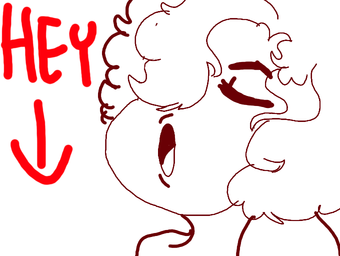
OKAY, Back, to start off, my favorites are by far "Convince Me..." and "Class of twentyeighteen"
I try not to judge on lines, but those two knock everything else outta the ball park with line ability.
Linework: This is important to remember, since threeD hides mistakes, I looked through everything without threeD. The newer part of your gallary looks a bit rushed and too harsh.Even this drawing here is a bit inconsistant. The thick lines look closer yet her hair and jaw look further away. As a general rule I never use black as an outline color.
Color: you have a good eye for color. Be careful about the saturation of your colors [desaturated are closer to gray] Even a fully saturated red will pop out from being next to an desaturated green. Even if that red is on the background is on the layer.
If you ever have any questions, I'll try to draw tutorials of anything, so feel free to ask!
my source: I am a university art studio major student.
24 Jun, 2016, 8:25 pm
The colors, shading, and the visuals are very neat, the only thing that might stand out is the posing and such, but other than that, it's good. :v