
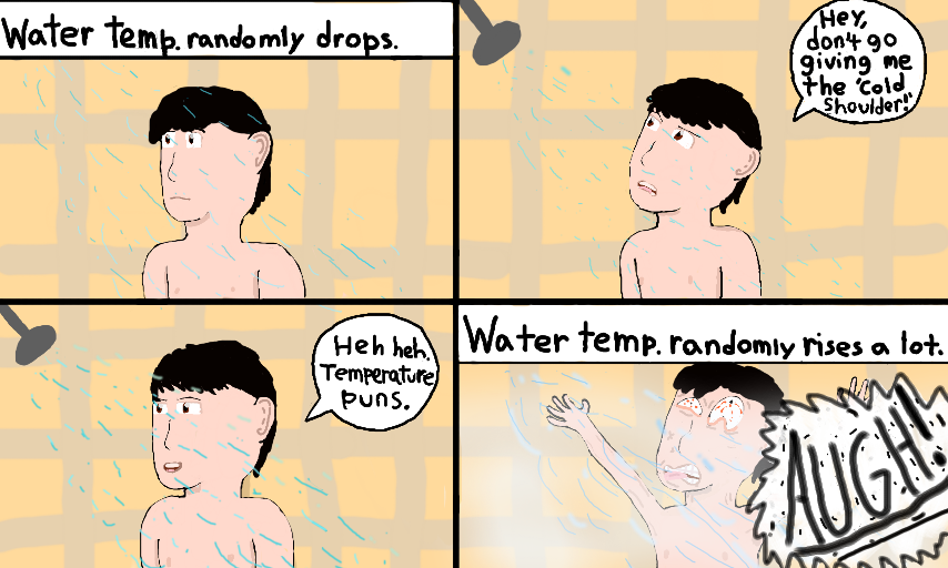
Shower Temperature by Jon Corp Productions
This was an experiment in both art and dialogue. I've been trying to find a way to make my "Johnny Style" (what I call my cartoony drawings) look more...pleasant to the eye. Except for that last panel. That one's ugly on purpose.
So, I guess I'll see how many people agree with the shower on the dialogue. Well anyway, have a nice day!
#JonCorpProductions #JohnnyJ #Comic #Shower #Puns #Water #Temperature #Bathroom #Hot #Cold #AUGH
Comments
7
like
reference image
eraser
eyedropper
time taken
nsfw
flip
undo
paint with friends
private
used tools icons
500
100
25
5
1
The comment has been reported
The Colors! Gallery moderators will look at it as soon as possible.
delete comment?
just delete
delete comment and prevent this user from commenting on your paintings
report as inappropriate
confirm
Comments
29 Mar, 2016, 5:09 pm
rip shower water
29 Mar, 2016, 6:26 pm
I've had this a few times, mainly for cold. xD
panel 2's facial design is actually pretty good, Jon! and even Panel 4 xD
29 Mar, 2016, 7:28 pm
Hate it when that happens. xD
29 Mar, 2016, 8:53 pm
It happens frequently tbh XD
29 Mar, 2016, 10:27 pm
Yeah. I've had those unexpected moments with showers... X )
30 Mar, 2016, 5:42 pm
re: Well, to improve the other ones? I think eye placement is a key. Panel 1/3's eyes are a bit too close to each other, while p2's is just right I think, and it's facial structure is pretty good, the cheek-to-chin shape is pretty good, but the prior and former's is too flat, unless that's your general cartoon style, (which I have my "comic style" with flat cheek-chin) but for a more human-like cartoon, p2's is much closer.
P2's arms could be a bit thicker, and his(your?) shoulder could blend with the arm's motion, because the shoulder should move with the arm.
Also, the ear could be closer to the face, it seems a bit far to the back of the head. If your head was facing completely left/right, the ear would be about the middle, so when your head is at an angle, the ear should angle accordingly. This is exempt if you're going for a comic/toon style, where ears are often goofy or misplaced anyway (like Jon's in Garfield)
xD Jon and Jon xD
Hope this helps?
31 Mar, 2016, 5:33 am
"It burns!"
Oh, man. I feel his pain. Nice comic!
:D