
Notes for self ref by Insomnibutt
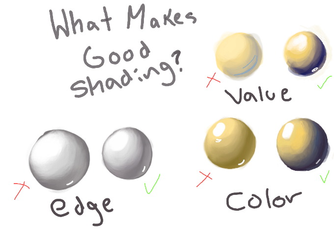
Edge: Having sharp edges prevents the entire piece from becoming blurry. Figure out where the shadows will be harshest
Color: Using darker shades of the base color looks muddy/lazy. Do your research and use different colors
Value: Without a variety of values, the piece will look monotonous/flat. Plan out your darks and lights to prevent this.
#insomtutorials
Comments
5
like
reference image
eraser
eyedropper
time taken
nsfw
flip
undo
paint with friends
private
used tools icons
500
100
25
5
1
The comment has been reported
The Colors! Gallery moderators will look at it as soon as possible.
delete comment?
just delete
delete comment and prevent this user from commenting on your paintings
report as inappropriate
confirm
Comments
29 Feb, 2016, 5:48 am
OOOOhhh nice. I'll keep these tips in mind as well.. Thanks for doing this.
29 Feb, 2016, 11:32 am
@Tides of Wonders- No prob, glad it could help!
01 Mar, 2016, 1:08 am
man, i always forget edge and i never realize how much of a difference it makes. color is hard for me too because i'm too conservative and afraid of it.
06 Mar, 2016, 1:30 am
I feel ya, I usually lose track of my values n have to spend most the time correcting them
20 Mar, 2016, 11:18 pm
*EDIT* With everything I mentioned above, I wanna add that you shouldn't underestimate the use of black. Of course, if you use ONLY black to shade things it'll look a bit melancholy, but a little can go a long way to refine shapes