
Daily 279 by Papercut
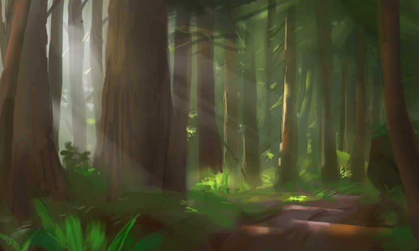
Evergreens are tricky to paint, they are so samey and tend to skew any composition very vertically.
You can find more of my work at:
http://syncup.deviantart.com/ and https://torewesolowskidesign.artstation.com/
にほんごもだいじょうぶです。
Comments
9+
like
reference image
eraser
eyedropper
time taken
nsfw
flip
undo
paint with friends
private
used tools icons
500
100
25
5
1
The comment has been reported
The Colors! Gallery moderators will look at it as soon as possible.
delete comment?
just delete
delete comment and prevent this user from commenting on your paintings
report as inappropriate
confirm
Comments
15 Feb, 2016, 6:41 pm
GREAT! I especially like the way the light shines through the trees!
15 Feb, 2016, 6:46 pm
Thank you :)
15 Feb, 2016, 6:48 pm
Very forest. Many green. Such tree.
15 Feb, 2016, 6:51 pm
Thank you for the thorough analysis Doge!
15 Feb, 2016, 7:21 pm
Wow, I love the reddish soil against all the greenery, and the white lighting makes the forest look so mystical and beautiful! :D
15 Feb, 2016, 8:00 pm
Woah that shading looks amazing!
15 Feb, 2016, 10:03 pm
@FadingGlory & @Fluffyweasel Thanks! A lot of it comes down to trial and error, with a little help from an understanding of light and material.
You can learn so much by just looking at things in different lighting conditions, analysing what's going on.
16 Feb, 2016, 9:03 pm
Haha right, would have to be a pretty intense forest fire to give off that wavelength!
17 Feb, 2016, 7:09 pm
Beautiful. I love the sun rays. Reminds me of the Nature Glade trail in the Olympic rain forest.
22 Feb, 2016, 11:58 pm
wow! a peaceful place to walk!
01 Mar, 2016, 7:56 am
You could also try adding more horizontal elements, an overgrown ledge, a fallen tree etc. to break up the verticality, or embrace it as a cathedral of nature and highlight the verticality.
01 Mar, 2016, 8:06 am
Oh those rays between the trees! It reminds me my walk in the woods!