
Daily 240 by Papercut
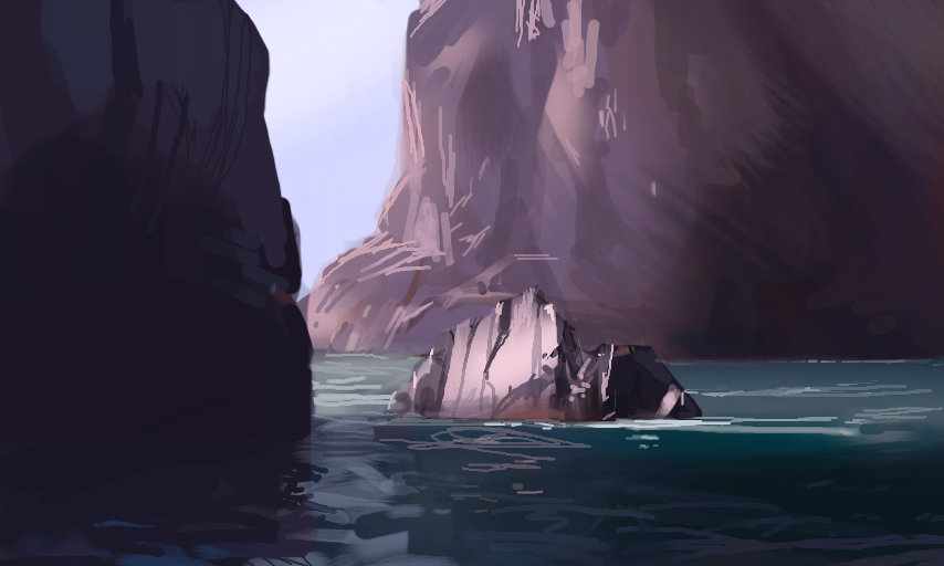
I'm a sucker for clear and simple lighting situations. Mainly because muddiness occurs whenever the difference between light and shadow is unclear or inconsistent (not just regarding brightness or values but also color temperature).
You can find more of my work at:
http://syncup.deviantart.com/ and https://torewesolowskidesign.artstation.com/
Comments
8
like
reference image
eraser
eyedropper
time taken
nsfw
flip
undo
paint with friends
private
used tools icons
500
100
25
5
1
The comment has been reported
The Colors! Gallery moderators will look at it as soon as possible.
delete comment?
just delete
delete comment and prevent this user from commenting on your paintings
report as inappropriate
confirm
Comments
07 Jan, 2016, 9:57 pm
beautiful!
07 Jan, 2016, 11:20 pm
Thank you!
07 Jan, 2016, 11:58 pm
This is gorgeous!
08 Jan, 2016, 1:22 am
more talent
08 Jan, 2016, 2:58 am
Wow. This painting looks absolutely gorgeous.
I'm not even sure what attracts me to this piece of art, but it just awes me in every way... wonderful job here!
08 Jan, 2016, 5:13 pm
hi, im in love with that deep blue patch that you added to the lowee right, it just says to me that you dont need alot of color everywhere to make it stand out, i really want to figure this out one day. :] :[ :l
08 Jan, 2016, 11:49 pm
@HalfScape & @Hyacinth Thanks!
@FadingGlory Thank you, really glad you like it then!
@TroyWalterGuajardo It's very much like you say, less is more. If everything is deep blue, then nothing is deep blue. You need those desaturated parts to create an interesting contrast :)
14 Jan, 2016, 8:04 pm
cool art