
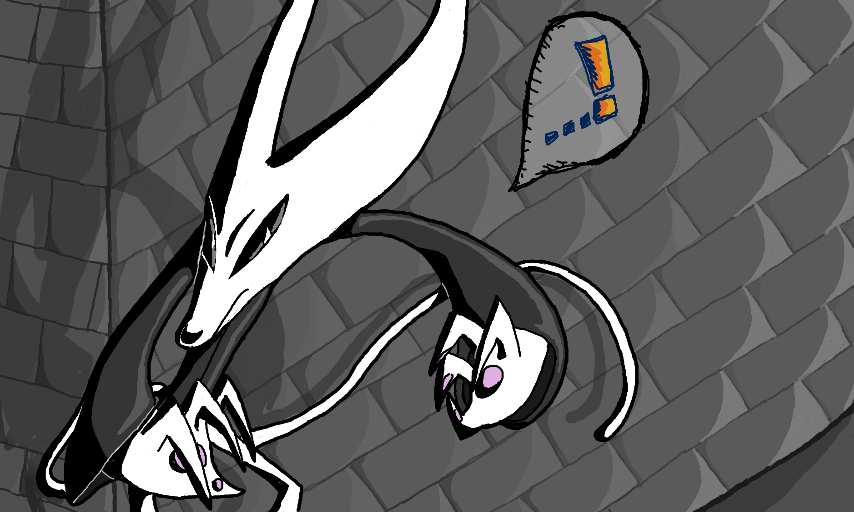
Pensive by Texabella
A remake of a painting I did a long while ago that I used to think was really something before recently realizing that it's ugly as sin.
Heck, this really isn't much better, considering I spent multiple hours trying to get the brick wall right and having the final result still looking crooked and shet.
Ugghhfybgfg.
Lesson learned, kiddies: Brick wall backgrounds are bad, and you should feel bad for attempting to use them.
I know I do.
#Lucifer #cat
Comments
5
like
reference image
eraser
eyedropper
time taken
nsfw
flip
undo
paint with friends
private
used tools icons
500
100
25
5
1
The comment has been reported
The Colors! Gallery moderators will look at it as soon as possible.
delete comment?
just delete
delete comment and prevent this user from commenting on your paintings
report as inappropriate
confirm
Comments
18 Oct, 2015, 8:58 pm
re: really? thanks. :D
18 Oct, 2015, 9:15 pm
I did new reference sheets for my characters lately. I was proud of all of them, then I looked today at them, and I thought they were ugly. xD
18 Oct, 2015, 10:56 pm
Re: Kind of thanks! :)
This looks exquisite!
Great job! :D
19 Oct, 2015, 1:55 am
This IS really something! I love Lucifer's position :D
And yeah, brick walls are really annoying
21 Oct, 2015, 5:17 am
this is great wow
I think the brick wall looks nice too though