
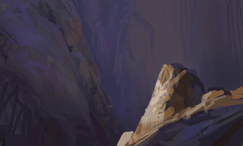
Daily 157 by Papercut
Tried to really find the right values here. But it's easy to get lost in the endeavour of just making pointless brushstrokes.
Will answer you guy's comments first thing tomorrow! Just need to get some sleep now.
Comments
4
like
reference image
eraser
eyedropper
time taken
nsfw
flip
undo
paint with friends
private
used tools icons
500
100
25
5
1
The comment has been reported
The Colors! Gallery moderators will look at it as soon as possible.
delete comment?
just delete
delete comment and prevent this user from commenting on your paintings
report as inappropriate
confirm
Comments
16 Oct, 2015, 10:13 pm
Interesting... it feels nearly abstract!
16 Oct, 2015, 10:13 pm
the light on the rock is nice, background could use more color but still nice
17 Oct, 2015, 9:12 am
@assasin667 haha yeah
@JJMAwaken I'm not too worried about the color. The problem is that the values do not fall off correctly with atmosphere, so it ended up losing it's depth.
17 Oct, 2015, 3:54 pm
I think it looks great! I really don't know how to word it, but the duller background and limited lighting really bring your attention to the rock, giving it a singled-out and special feel to it ^-^