
Daily 49 by Papercut
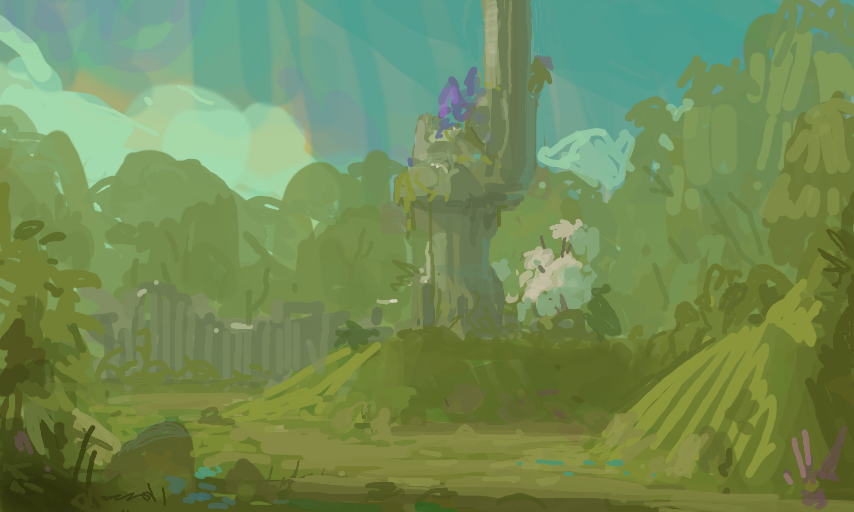
Out of the harsh desert, and back to a slightly more tranquil place ^^ I'm still failing at getting the contrast that I'm after, but at least I think the values are getting more internally consistent. If that makes any sense ...
Comments
4
like
reference image
eraser
eyedropper
time taken
nsfw
flip
undo
paint with friends
private
used tools icons
500
100
25
5
1
The comment has been reported
The Colors! Gallery moderators will look at it as soon as possible.
delete comment?
just delete
delete comment and prevent this user from commenting on your paintings
report as inappropriate
confirm
Comments
30 Jun, 2015, 4:40 pm
your recent paintings, where you are more satisfied with the values, look a bit washed out to me. it could be personal taste but I also think your 3ds brightness setting might be different from mine? I have mine on the highest setting. anyway, I really like how you've used a little purple to create a focus in this picture!
30 Jun, 2015, 6:20 pm
Yeah, I agree. To be more specific about what I was happy with: I had a problem with seeing/using subtle value shifts, which is why I decided to stop relying on high contrast for a while. So in regards of what I set out to fix, I feel ok. But it is definitely time to put it all together again, thanks for pointing it out!
30 Jun, 2015, 6:50 pm
have you ever thought of mixing two completely different enviorments together? like a desert and forest, or a volcanic wasteland with ponds or oceans? i think thatd be pretty cool to see from you :o
02 Jul, 2015, 10:29 am
Actually, I have thought about that. And if I can figure out a way to make sense of it, I'll totally do it :)