
Daily 40 by Papercut
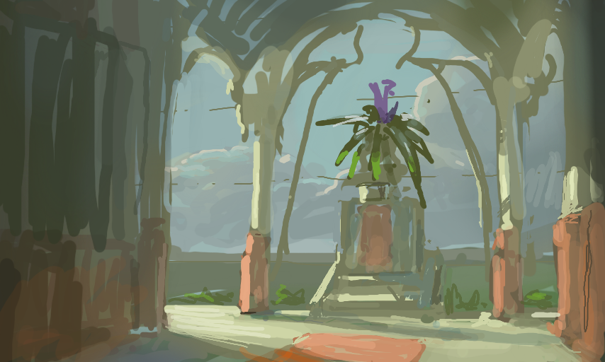
Trying to figure out how to juggle design, composition, value, color, etc. Turned out really muddy for some reason, I think it happens when the values of lit and shaded areas get too close together in some instances. Need to work more on that.
Comments
6
like
reference image
eraser
eyedropper
time taken
nsfw
flip
undo
paint with friends
private
used tools icons
500
100
25
5
1
The comment has been reported
The Colors! Gallery moderators will look at it as soon as possible.
delete comment?
just delete
delete comment and prevent this user from commenting on your paintings
report as inappropriate
confirm
Comments
21 Jun, 2015, 4:13 pm
just looking thru your gallery, not one picture I didn't like, you've got the right stuff!
21 Jun, 2015, 4:51 pm
Thank you for the follow Rhignome, I'm glad you like my stuff!
21 Jun, 2015, 7:42 pm
looks cool, I had a feeling it was one of yours from the thumbnail pic, I think you always do a nice job on the lighting and the composition
22 Jun, 2015, 4:18 am
The colours do look kind of "washed out"---not a ton of contrast, but it's kind of interesting that way.
22 Jun, 2015, 8:11 am
beautiful sky! :D
24 Jul, 2015, 3:47 am
this... is... AWESOME!!!