
Daily 33 by Papercut
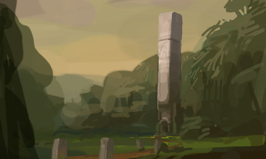
I'm trying to slow down a bit again. By using simpler subject matter, I get to focus more on harmonising the colors and values in a more natural way. (This is actually Daily 34, my bad.)
Comments
5
like
reference image
eraser
eyedropper
time taken
nsfw
flip
undo
paint with friends
private
used tools icons
500
100
25
5
1
The comment has been reported
The Colors! Gallery moderators will look at it as soon as possible.
delete comment?
just delete
delete comment and prevent this user from commenting on your paintings
report as inappropriate
confirm
Comments
15 Jun, 2015, 1:24 pm
This looks so very beautiful! I just love the WHOLE picture!!! Plus at first I instantly thought... HALO. : P
15 Jun, 2015, 1:26 pm
Thanks! Also, I knew I would mislabel these eventually. Wellp, sorry about that.
15 Jun, 2015, 6:51 pm
Thanks for your advice on "loose"-looking painting. Looking at some old ones, I see I was rapidly making many transparent strokes in an attempt to get a "painted look." It was a mess.
The nice colours here (especially the sky) give a feeling of... tranquility. Maybe birds could add to the scene--show depth and point the viewer in a direction, perhaps? Sorry for the long comment.
16 Jun, 2015, 2:38 am
I love your environment designs
16 Jun, 2015, 10:22 am
@asassin667 Cool, I'm happy I could help. Birds is not a bad idea, it's a bit cheesy, but so are most of my paintings tbh. I think it would work well.
@Lilyflower Thank you! No worries, I think reference is crucial to be able to improve. When you learn, you need to absorb information from somewhere, and reference contains a lot of that. Use photographs, real life and professional painters work that you like. But don't just copy the reference, I think it's better to spend most of your time trying to create your own paintings, using the reference where you feel like your knowledge is lacking (how does this type of rock actually look? what kinds of clouds could be here? etc).
@Flame Blade Thanks!