
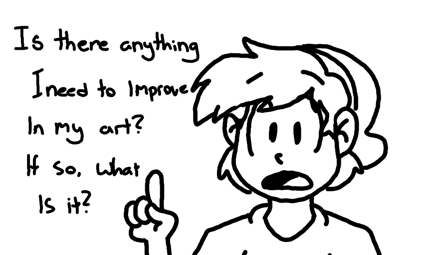
"Customer Satisfaction Survey" by FamicomLink
Just curious. :P
#FamicomLink #question #Survey
Comments
4
like
reference image
eraser
eyedropper
time taken
nsfw
flip
undo
paint with friends
private
used tools icons
500
100
25
5
1
The comment has been reported
The Colors! Gallery moderators will look at it as soon as possible.
delete comment?
just delete
delete comment and prevent this user from commenting on your paintings
report as inappropriate
confirm
Comments
16 Mar, 2015, 6:13 am
Hmm, I can't pick out any glaring flaws, so I'd just say to experiment a lot (which you often do) to find ways to refine your style. Also, I'd play more with color. Your low-saturated look is easy on the eyes, but I think you could work more on shifting the hues of colors while changing the value. The latter looks a bit muddy in cartoon drawings and shifting the hue to a dominant color while shading would make a nicer image.
Good gravy this is a long comment.
16 Mar, 2015, 8:37 am
I would say based on the drawing here, you could work on smoothing out lines (like on your drawings chin and top of the mouth). Also, your hand looks a bit out-of-place, so maybe make the pointer finger closer to the thumb.
but thats just what i think! your art looks good!
17 Mar, 2015, 2:42 am
You're a very good artist as is, but however there is some things you should work on. One recommendation is to do a lot of background art, secondly work on your shading.
19 Mar, 2015, 5:55 am
Ehhhh heres an idea, try doing some realistic stuff :3 its hard >.<