
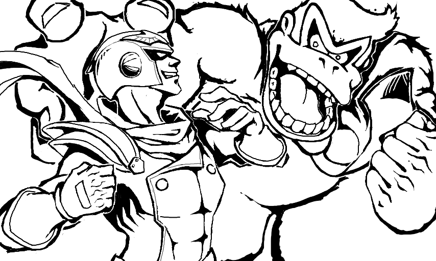
Outline by ScribZ
You dont need to like this! Im clearing out my ds. This is just for reference for the future on how i ink. I would appreciate a comment on it though- Things that need improvement or stuff that looks weird, etc. So, uhh... thanks. #ScribzSketch
Comments
8
like
reference image
eraser
eyedropper
time taken
nsfw
flip
undo
paint with friends
private
used tools icons
500
100
25
5
1
The comment has been reported
The Colors! Gallery moderators will look at it as soon as possible.
delete comment?
just delete
delete comment and prevent this user from commenting on your paintings
report as inappropriate
confirm
Comments
05 Mar, 2015, 1:11 am
Let's see... looking at this, I would improve...
Uhhh... My own art.
Geezus man, it looks pretty darn perfect to me, normally I'll at least try and nitpick, but I can't find anything. ;-;
05 Mar, 2015, 1:51 am
@Howling- Thanks man! Actually i noticed myself that C.Falcons gloves are different. I fixed that in the final product though.
05 Mar, 2015, 3:22 am
Skrew you man I'm liking this! For things that need improvement, I'd say bring back Donkey Kong's abs - those were bomb!
05 Mar, 2015, 3:28 am
You can't stop me from liking >:D
05 Mar, 2015, 6:34 am
Yeesh, trying to find something wrong with this is like an intense game of Spot the Differences. Only thing I could possibly say looks a tad bit off is DK's left fist, but I couldn't even tell you exactly what's off about it so it's prolly just my eyes being stupid and not being able to tell what they're looking at.
Your style is among my favorites in this land of artists my friend.
I too must be disobedient and like this. -.-
06 Mar, 2015, 2:02 am
@Elsola- Lol Dks abs! Yeah he doesnt look awesome w/out it. :D I try to hold back in outlining that and do it in coloring. Gotta improve my coloring.
@Daking- Thanks! >:D
@tinyWaffles- Thanks! I I'm trying to aim for a certain style, but idk what it is (-__-)"
Im glad you like it!
07 Mar, 2015, 12:23 am
Dat ink thou. It's too awesome *dies*
02 Apr, 2015, 7:16 am
"Don't need to like this." Psh.