
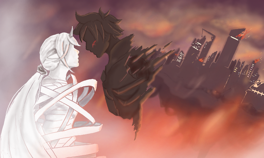
Remake Progress by Lynarc
A remake of my fav pic on my second account. "Going to work on this over a long period"
I didn't really think of what style I should use before starting this lol.
Things to change/improve
-Colouring style used on characters
-City detail
-Contrast between characters and background?
*Any other suggestion would be greatly appreciated :) *
#lynarc #lynarcoc
Comments
6
like
reference image
eraser
eyedropper
time taken
nsfw
flip
undo
paint with friends
private
used tools icons
500
100
25
5
1
The comment has been reported
The Colors! Gallery moderators will look at it as soon as possible.
delete comment?
just delete
delete comment and prevent this user from commenting on your paintings
report as inappropriate
confirm
Comments
17 Jan, 2015, 5:15 am
QAQ Dannng man dat Background is beautiful!!!
Style? I like what you're going with like a animation style i think you should stick with it Cuz it goes with the Background.
Tips O.o How bout adding a litte more highlighting to the way edge of the buildings like outlining it with a brighter color. try it & see if you like it o3o)b
18 Jan, 2015, 1:13 pm
will do! Thanks :)
20 Jan, 2015, 8:28 am
No prob ;)
20 Jan, 2015, 8:30 am
XD And don't forget to sign dat sucker when you're done. XP
22 Jan, 2015, 6:14 pm
I think this pic is perfect. I love it.
25 Jan, 2015, 9:54 pm
This is so freaking cool no matter what version you post! Like I just can't even take it!