
reference image
eraser
eyedropper
time taken
nsfw
flip
undo
paint with friends
private
used tools icons
500
100
25
5
1
The comment has been reported
The Colors! Gallery moderators will look at it as soon as possible.
delete comment?
just delete
delete comment and prevent this user from commenting on your paintings
report as inappropriate
confirm
Comments
26 Dec, 2014, 5:49 pm
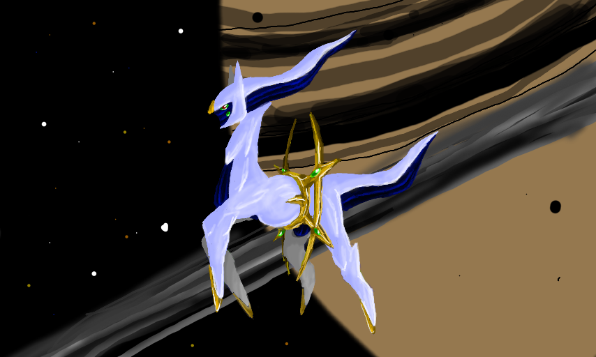
As for constructive criticism:
The 3D is a little too deep, as Arceus looks like two seperate beings.
Oppositely, the background is a little flat, as the stars look just as far away as the planet if 3D is on.
I'd recommend putting the planet on a different layer than the stars and void, to put emphasis on the planet. Beyond that, lessen the overall 3D effect, so it's more subtle.
That being said, Arceus looks great! The shading is well done, and it being more detailed than the background helps draw attention to the focus point of the piece. The pose and eyes create a certain sense of life and movement.
Hope this helps!