
Hmmmm by Endogeny
Honestly, I invented my old signature eons ago. /:D I designed a new one, and if you guys have been viewing my main, I've been trying it out a bit.
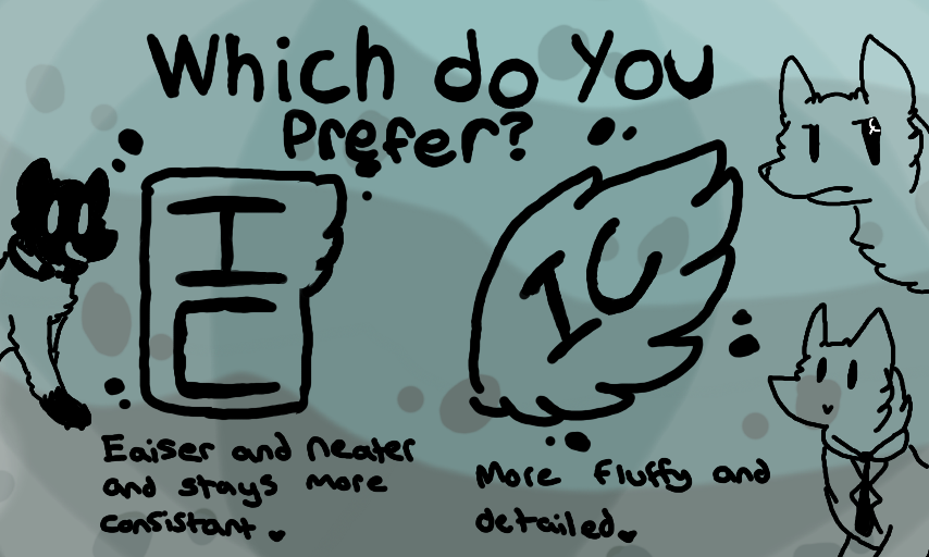
One more thing:
-The left one is MUCH easier to fit in to stuff, especially serious things. :D
So, which do you guys prefer/like more?
#Help #Signature #Watermark #IWantYourOpinion :>
Comments
7
like
reference image
eraser
eyedropper
time taken
nsfw
flip
undo
paint with friends
private
used tools icons
500
100
25
5
1
The comment has been reported
The Colors! Gallery moderators will look at it as soon as possible.
delete comment?
just delete
delete comment and prevent this user from commenting on your paintings
report as inappropriate
confirm
Comments
11 Aug, 2014, 7:55 pm
I like both, but honestly, the square-shaped one looks more unique and original. I see wings in signatures EVERYWHERE, whereas the one on the left shows a subtle wing-like design. c;
11 Aug, 2014, 7:58 pm
Thanks, Takita! :D
11 Aug, 2014, 8:02 pm
No problemo. xD
11 Aug, 2014, 9:25 pm
Either to me is fine, as long as it's in there. ;)
11 Aug, 2014, 10:58 pm
Takal's right.I prefer the left one because it's unique and more creative!It really brings out your character! :D
20 Aug, 2014, 12:53 am
LEFT! It kinda reminds me of those old Japanese paintings, and it's much better compositionally.
31 May, 2015, 1:10 pm
I like right, it just looks awesome! .w.