
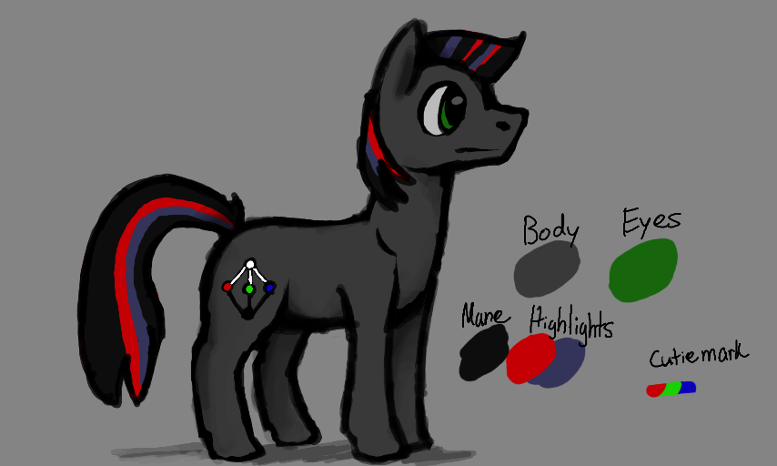
Suggestion by Athens
Here's what I thought looked better. I found the blue mane and red tail very unappealing, because not only were they opposite saturated colors, but they were on the opposite sides of the pony. Here, I desaturated the blue, put both colors on the mane and tail, and added black to make them more cooperative. I tried to leave everything else untouched, since I personally only had a problem with the mane/tail.
This is only a suggestion, because I don't consider myself an expert on design.
Comments
3
like
reference image
eraser
eyedropper
time taken
nsfw
flip
undo
paint with friends
private
used tools icons
500
100
25
5
1
The comment has been reported
The Colors! Gallery moderators will look at it as soon as possible.
delete comment?
just delete
delete comment and prevent this user from commenting on your paintings
report as inappropriate
confirm
Comments
03 Aug, 2014, 9:26 pm
I'll try to be on pokemon for most of today, so just catch me when you're available. :D
03 Aug, 2014, 10:04 pm
The design is nice though. :>
04 Aug, 2014, 5:38 am
Alot better than tge other one, but maybe desaturate the re a teeny bit more? It sorta 'overpowers' the blue