
Profile by TowerWolf
SAGEY. YOUR HOOMAN DUST IS WORKING. :D I'm super proud of this and I'm hoping to get more than 10 likes this time. Maybe 25? Unlikely, but worth a shot. :3
Feedback?
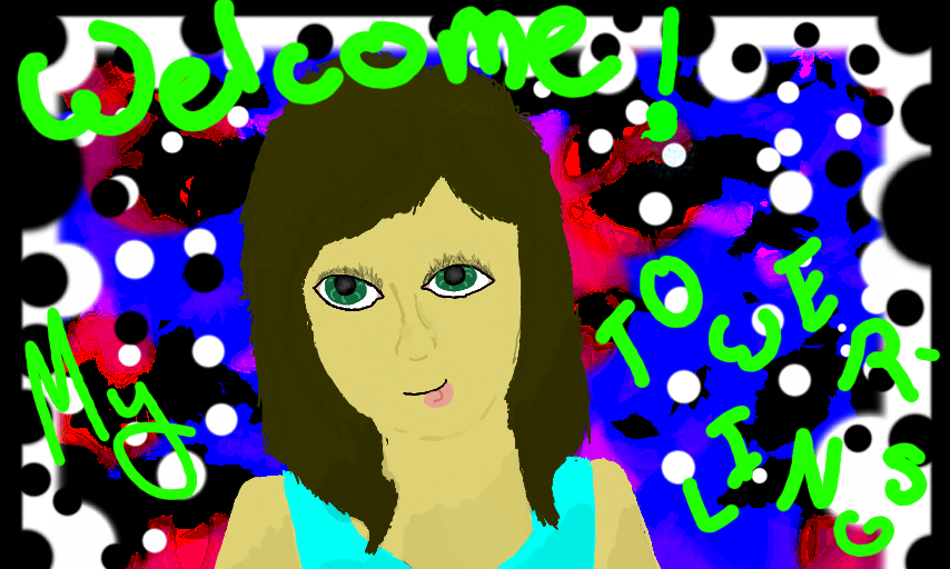
Yes, this is me. LOOK AT IT. Happy nightmares :)
#Towersstuff
Comments
7
like
reference image
eraser
eyedropper
time taken
nsfw
flip
undo
paint with friends
private
used tools icons
500
100
25
5
1
The comment has been reported
The Colors! Gallery moderators will look at it as soon as possible.
delete comment?
just delete
delete comment and prevent this user from commenting on your paintings
report as inappropriate
confirm
Comments
06 Jul, 2014, 4:07 am
your really good at humans unlike me! i can draw animals way better than human : D
06 Jul, 2014, 4:07 am
Better hooms than I can do. XD
06 Jul, 2014, 4:14 am
This is amazing! I hope you get the likes! You deserve them! :D
06 Jul, 2014, 4:59 am
Wow this looks so awesome Tower! I hope that you get all the likes that you are aiming for. ^-^ I can't draw humans at all so to me you are just awesome, since you can draw both humans and animals very well! ^-^
Keep up the positively brilliant work Tower! ^-^
06 Jul, 2014, 10:04 am
cute♪
07 Jul, 2014, 6:06 am
You really did a great job on the face realism! I struggle at drawing faces (the last one took 3 hours to sort of get okay), so I can appreciate it when I see it. And thank you for your comment! I know how hard it can be to stand out when you know your followers follow hundreds of people and lots of art gets lost in the feed. I looked through your gallery and hope these tips can help: One thing that I've found is that colors are very important to catching attention. I notice you use a lot of primary colors, like black, white, blue, red, etc. Try some shades between with more blending. The easiest way to do this is to put your brush on slightly transparent, so you see through the color just a little. If you do a lot of soft brush effects for the background then the main part of the painting will stand out more if it has more contrast. For example, let's say this painting had a lot of blurry, soft colors in the background. The main part of the painting (you) would stand out.
07 Jul, 2014, 6:11 am
You can even make the background colors slightly darker or lighter right behind you and see how that looks. Also, try experimenting with shading techniques. That really helped me. Even you don't get it exactly right, it'll still look good in the small preview and draw people in. Also, I've noticed that people spot neat looking text easily, so I started doing guidelines and spending sometimes up to an hour just on the text. It may seem time consuming, but every detail you add helps draw viewers in. In fact, I think since you look pretty in this that flowers floating around in the background would look nice. I hope some of these suggestions help and if anything was unclear, please ask. :3