
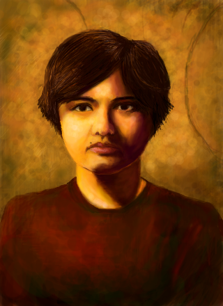
Self Portrait - style of Rembrandt by uilleanngirl
Entry for weekly challenge. Specifically I tried to get the feel of this painting http://www.ibiblio.org/wm/paint/auth/rembrandt/self/rembrandt.1661.jpg I've always loved it.
Comments
9+
like
reference image
eraser
eyedropper
time taken
nsfw
flip
undo
paint with friends
private
used tools icons
500
100
25
5
1
The comment has been reported
The Colors! Gallery moderators will look at it as soon as possible.
delete comment?
just delete
delete comment and prevent this user from commenting on your paintings
report as inappropriate
confirm
Comments
26 Jun, 2009, 4:08 am
you captured the essence of rembrandt very well. good luck in the challenge :)
26 Jun, 2009, 4:16 am
Thank you. :)
26 Jun, 2009, 4:49 am
that is rad.
26 Jun, 2009, 5:00 am
Thanks pondocus, so is yours!
26 Jun, 2009, 5:29 am
we got the winner
26 Jun, 2009, 6:10 am
Star!
26 Jun, 2009, 1:04 pm
Great choice and a great self portrait! You have a star from me! :)
26 Jun, 2009, 1:26 pm
amazing. I watched the little movie. I'm blown away! Gotme to register and got my star:)
26 Jun, 2009, 1:42 pm
Aw, thanks guys. :)
26 Jun, 2009, 3:22 pm
I like this one. The colors really resemble the master, though he used more contrast (brigth light on his cheeks and nose).
26 Jun, 2009, 6:37 pm
Yeah, I know... it looked brighter and sharper on the iPod... It's hard to predict how they'll turn out on the computer screen. :/
27 Jun, 2009, 1:31 pm
Nice one. You've got Rembrandt's rich warm colour choices down, but maybe the background should have been darker to sell his style a little more? Good job, though. :)
27 Jun, 2009, 2:27 pm
=)
28 Jun, 2009, 5:55 am
@ Munin: yeah, you may be right. Also should have been from farther back, with more negative space... but I didn't want to waste space on the little iPod screen; without being able to zoom in farther, it would be really hard. At least for me.
And I should have given myself a little white hat like his! :D
28 Jun, 2009, 10:52 pm
Hello you !!! jajajaja ... nice work too.
Now i know the face of my fellow artist!!!
congratulations and good luck, uillieanngirl!!!
28 Jun, 2009, 11:51 pm
"...should have been from farther back, with more negative space..." @ Uilleanngirl: Haha... You're working in a very limited environment. You did a great job. I did not mean my comments to be taken as negative. Far from it. :)
29 Jun, 2009, 12:04 am
@ alan pina: good luck to you too! :)
@ Munin: No, I didn't think you were being negative! Critique is always welcome! I do see what's "un-Rembrandty" about it though. ;)
30 Jun, 2009, 9:05 am
I thought I already commented on this painting... oops.. Anyway, the colors are really beautiful. Great job & good luck :-)
30 Jun, 2009, 9:52 am
@ jaswinger: Aww, thanks. Good luck to you too!!
30 Jun, 2009, 10:28 pm
Uitstekend...that's "Excellent" in Dutch
09 Jul, 2012, 6:55 am
Excellent