
A Chart of the Current Colors Gallery by Klokwerker
Please note before you make rude comments with poor grammar that this chart was made with no (well, maybe a little) malice toward the groups represented. This is just the gallery as I see it.
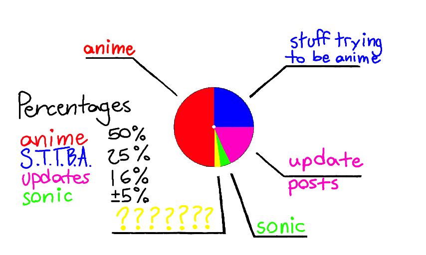
Also, a side note, the area marked with yellow question marks is reserved for "miscelaneous and quality product". The percentage of this group (at least at the initial release of this app) varied wildly between .2 percent and 75 percent.
Comments
3
like
reference image
eraser
eyedropper
time taken
nsfw
flip
undo
paint with friends
private
used tools icons
500
100
25
5
1
The comment has been reported
The Colors! Gallery moderators will look at it as soon as possible.
delete comment?
just delete
delete comment and prevent this user from commenting on your paintings
report as inappropriate
confirm
Comments
01 Jul, 2014, 2:32 pm
Love pie charts! c:
04 Jul, 2014, 9:12 am
!! XD you speak the truth Sir! i..well i guess i fall in the 16 percent a few times BUT IT WAS TO SAY HELLO OK
10 Jul, 2014, 6:32 am
the truth, i wonder where i stand in this chart