
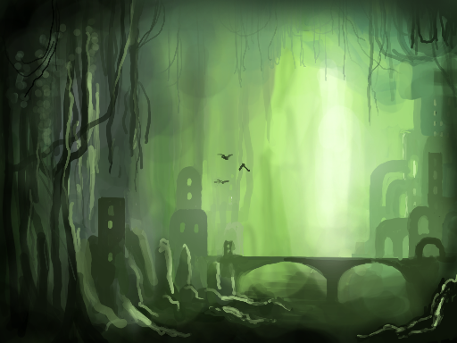
Swamp City by Johnson
Could not decide where to go with this one... but i wanted to upload something, so here it is.
looks like i couldn't come up with a more imaginitive design for the houses, so they are simply squares, i guess. sigh. time to move on.
Comments
9+
like
reference image
eraser
eyedropper
time taken
nsfw
flip
undo
paint with friends
private
used tools icons
500
100
25
5
1
The comment has been reported
The Colors! Gallery moderators will look at it as soon as possible.
delete comment?
just delete
delete comment and prevent this user from commenting on your paintings
report as inappropriate
confirm
Comments
23 Jun, 2009, 10:46 am
i kinda like it :)
23 Jun, 2009, 11:10 am
wicked! yeah i guess the buildings could do with some weird warped shapes, maybe more ruined? nice colour and tone throuought :)
23 Jun, 2009, 4:41 pm
I like the forms (arches and stuff) of the builings!
24 Jun, 2009, 1:41 am
I like this kind having the sense of space picture, I like this vice-work, if you are paying great attention the detail, it will be better: )
24 Jun, 2009, 8:52 am
if you want great scale, add tiny birds ;)
24 Jun, 2009, 8:03 pm
a director i worked with pointed that out every time the compositors worked on a big outdoors shot; rest assured they'd put birds in the scene, to his amusement. :)
great paint btw!
27 Jun, 2009, 6:24 am
Cool?
30 Jun, 2009, 8:38 pm
Very nice. You should experiment more with these enviros (as should I). I get a sense of art deco with the buildings on the right.
23 Aug, 2010, 3:38 am
I'm with jennyeatworld on this one. I like it too. :)
22 Apr, 2012, 9:27 am
E' fantastico! It 's great! ^^