
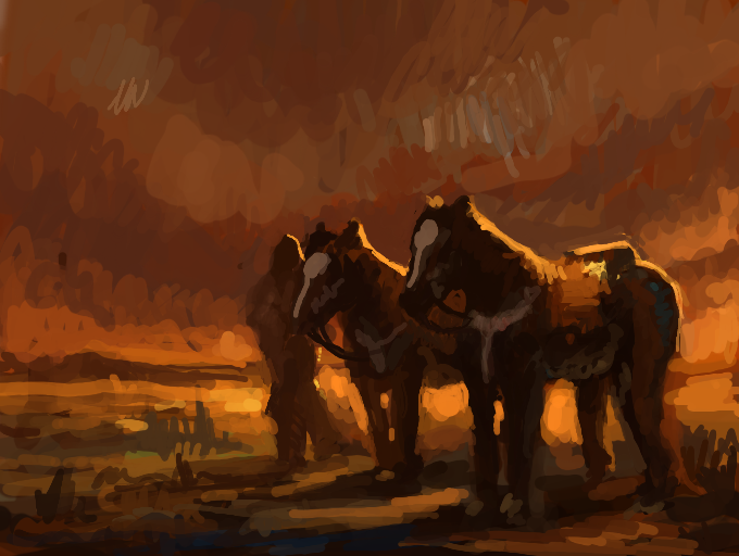
James Reynolds/TylerEdlin Quick Colour study by MO.SAID
My screen brightnes seems to get dimmer (on the highst brightness), i can't tell if am using the right colours or not. I was wondering if you find these colours dark or look washed out ?
Comments
9+
like
reference image
eraser
eyedropper
time taken
nsfw
flip
undo
paint with friends
private
used tools icons
500
100
25
5
1
The comment has been reported
The Colors! Gallery moderators will look at it as soon as possible.
delete comment?
just delete
delete comment and prevent this user from commenting on your paintings
report as inappropriate
confirm
Comments
21 May, 2014, 11:41 am
Amazing!!!!!!!!!!
21 May, 2014, 11:46 am
thank you :)
21 May, 2014, 1:09 pm
Colours look fine, like a watercolour. c:
21 May, 2014, 1:10 pm
It looks really good so far. The whole western look goes well. It has an orange sun set/sun rise look to it that I find very soothing. Colors look grea! :) Hope I helped.
21 May, 2014, 1:12 pm
You're not sure about your colors, and it's still better than I could ever do.
21 May, 2014, 1:16 pm
That's in my eyes absolut perfect...evening, and the Sun goes down...
21 May, 2014, 1:17 pm
Your colors and tones are very convincing! - and I love the portrayal of light without resorting to white.
21 May, 2014, 4:40 pm
So wonderfully good but doodley! I love it!
21 May, 2014, 4:42 pm
Looks fine to me, I have my brightness set very low. Very nice.
21 May, 2014, 5:15 pm
Few, it good to hear that, thanks everyone
21 May, 2014, 6:11 pm
my brightness seta on middle,.. i think little bit dark, but its still good ^^
21 May, 2014, 6:29 pm
the colours are amazing!
21 May, 2014, 11:20 pm
Wow! Great work! The colors look fantastic on my screen. 8 )
21 May, 2014, 11:46 pm
cool i love the lighting effects!
22 May, 2014, 12:44 am
i love this. i enjoy seeing desert-like images.
22 May, 2014, 12:53 am
This is beautiful...It really reaches out to me... Like, it makes me happy, but somehow it also makes me sad. I love paintings that invoke emotions.
Overall, great job! : D
-Tracie
22 May, 2014, 3:36 am
If you're unsure about the brightness, Colors has a website, where you can sign in, look at your own art, and judge for yourself.
Also, if your system is in powersaver mode (under brightness), that may be having an effect on how your screen behaves.
22 May, 2014, 8:58 pm
I guess it looks fine but then Im not sure what you were aiming for. I must warn about comparing the colors of the 3ds to the website. In my opinion the colors of my 3ds do not match the ones in the web. sometimes they look brighter sometimes duller and im not sure wich device to trust
23 May, 2014, 6:28 pm
Awesome painting, I love the colours, you have a great gallery I need to come back for a closer look when I get more time :) *+
24 May, 2014, 5:50 am
This is really nice to look at!
27 May, 2014, 9:58 pm
i hate the fact that pieces like this get lower rating than a crudely drawn comic with a cat
01 Jun, 2014, 6:07 pm
Mmmm, I like the mood here, very lovely.
02 Jun, 2014, 1:06 am
awesome
05 Jun, 2014, 3:40 am
That always happens to me, This looks really good
10 Jul, 2014, 4:52 am
Magnificent!