
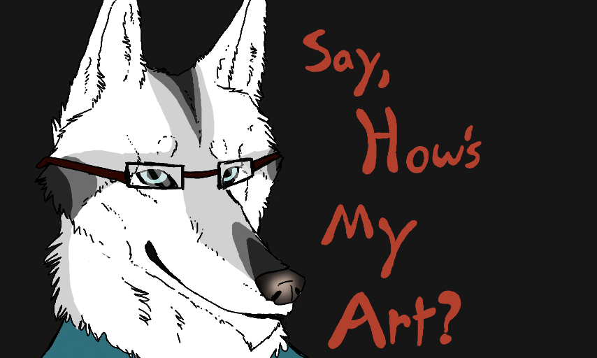
Hmm? by Quadruped
Now don't literally say, "How's my art?" Instead, give me some suggestions, what you'd like to see more of, and just general thoughts about my visual stimuli of color and line. And yes, I saw a few people doin' this, and I hopped on to the rollin' bandwagon. Also, Chris is feelin' mighty fine today. XD #Christopher #Chrissytopher #SomeStuff
Comments
9+
like
reference image
eraser
eyedropper
time taken
nsfw
flip
undo
paint with friends
private
used tools icons
500
100
25
5
1
The comment has been reported
The Colors! Gallery moderators will look at it as soon as possible.
delete comment?
just delete
delete comment and prevent this user from commenting on your paintings
report as inappropriate
confirm
Comments
20 Apr, 2014, 3:48 am
My groooovy font.
20 Apr, 2014, 4:10 am
dB Terribly amazing i wanna v'omit out rainbows...eww rainbows
20 Apr, 2014, 4:13 am
Heh, thanks you two. eue
20 Apr, 2014, 4:19 am
Pshhhhhhh, nooo. But thanks. ewe
20 Apr, 2014, 4:22 am
I say it's overall really great. But there are some things you could work on. Muzzles are /sometimes/ reoccurring as an issue. Chris's muzzle is somewhat disturbing me, same with his mouth. (Unless it's a part of his actual design.) Anthro hands are something that can be improved on, seeing as they are somewhat too small. But pretty good! We all have flaws. ^^
20 Apr, 2014, 4:24 am
Thanks for the advice! I know, I really ave trouble with hands. e-e But what specifically about the muzzle is it? It it too long? Or is it kinda flattish?
20 Apr, 2014, 4:29 am
I like to be surprised with what I'll sed next and my favorite thing about art is evryone's differents styles and you have a really unique style that I find interesting. I love all the art I've seen you do and I look forward to what you do in the future.
20 Apr, 2014, 4:32 am
*see
20 Apr, 2014, 4:35 am
I would say it's the way it slopes down. It just seems a lil' off. But then again it's probably a part of his breed I didn't notice. XD
I have a sheet for hands! I can draw sone of the things it shows to help. owo
20 Apr, 2014, 5:09 am
Maybe if you made shorter muzzles...The anatomy would be much better...but thats just my opinion ;_;
20 Apr, 2014, 5:10 am
Oh and the angle should be more...tilted ouo'
20 Apr, 2014, 5:30 am
Your pics like this with the lines are cool, but I really love your realistic side with shading. :)
20 Apr, 2014, 5:51 am
I personally notice that you use a lot of warm-color palates and dark earth-tones (most specifically greys and reds). I notice that a majority of your art always seems to have a very primal and feral feeling to it, and when design or draw fantasy creatures they often look alot like something from Del-Toro's or Peter Jackson's films (Pacific Rim, H3llboy, Pan's Laberynth, King Kong, The Hobbit, LOTR). Personally I'd recomend you to just keep doing what you're doing, your art is really creative.
20 Apr, 2014, 11:54 am
I don't really wanna legit critique your work, but maybe to gain some attention, you try a more...cartoon-y style on occassion? Don't get me wrong--I LOVE (and am envious of) your realistic style. I'm just saying maybe try to make it a little less detailed (and a little sillier xP) as an experiment :3
20 Apr, 2014, 12:50 pm
I dont know what more I would want to see, Cause youre amazing, So realistic, And Wunderful.
20 Apr, 2014, 2:22 pm
It is so incredibly awesome already! ^-^ But if you want to be as anatomically accurate as possible, maybe, depending on the lengths of your canids' muzzles, you could make them slightly shorter and add some tiny adjustments. :3
20 Apr, 2014, 2:29 pm
I LOVE your art. I have a couple of things for you to work on... I don't know how to word them. Hold on for a second. ouo
20 Apr, 2014, 2:36 pm
OK, so first of all
POSITIVES: Your 3D and realistic paintings are the best in your gallery. I especially love the way your 3D and textures work so smoothly.
THINGS TO WORK ON: Maybe not make the brush as transparent in some pics. I can sometimes see straight through the animal. (Not this one) And as people have been saying, make the muzzles a tiny bit shorter.
And dat's all. :) I feel so critiqueish. (not a word) XD
20 Apr, 2014, 2:38 pm
The transparancy in some pics is intentional. I use the dark background as the shading, laying lighter colors on top of it. Like the snake one. Completely intentional.
20 Apr, 2014, 2:41 pm
I think your art is Awesome! :D
20 Apr, 2014, 3:05 pm
I love your art! ^-^
I think that you should stick to the more realistic looking art but, that's just my opinion.
Keep up the amazing work Quadruped!
20 Apr, 2014, 4:05 pm
I love your art, honestly. It's magnificent. But one complaint (It's TINY) is your BGs are really dark. :> But that's not even really a big complaint. Keep on drawing, Quadri!
20 Apr, 2014, 4:24 pm
Yes, I like the snake one. But, I seriously can't talk today. My wording is horrible, so I guess that's not what I ment XD
There's only one thing left to say... Happy Easter!
20 Apr, 2014, 4:27 pm
I honestly love all of your artwork your like one of my idolsss <3
Thoigh I usually dont comment because im kinda shy and I have lots of people ive followed so if I ended up commenting to everyone uhhh well thats too much for me xD
20 Apr, 2014, 9:09 pm
i honestly don't see why people ask this question. if you like your art, then that's all that matters. you shouldn't need others to tell you.