
NOOOO! by 32BIT
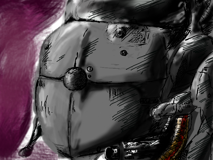
FAILURE! NOOOO ! LOOK AT THE ORIGINAL CONCEPT ART THEN LOOK AT THIS! I NEVER SHOULD'VE COLORED IT! IM 14 BUT IT LOOKS LIKE A 5 YEAR OLD COLORED IT! unn....i'm never gonna be good enough for adult swim/ cartoon network....
Comments
9+
like
reference image
eraser
eyedropper
time taken
nsfw
flip
undo
paint with friends
private
used tools icons
500
100
25
5
1
The comment has been reported
The Colors! Gallery moderators will look at it as soon as possible.
delete comment?
just delete
delete comment and prevent this user from commenting on your paintings
report as inappropriate
confirm
Comments
05 Jun, 2012, 2:34 am
I haven't seen the original and I'm still impressed. Take it from me, you're better than you know it. I have people telling me that my work is great, but I can never agree. What I'm trying to say is never give up.
05 Jun, 2012, 2:34 am
don't be so hard on yourself! it's not cartoon network style, but it looks like its straight out of a wicked comic for sure. maybe you should draw comics instead of cartoons ^^
05 Jun, 2012, 2:35 am
Nonsense. I haven't seen the concept, but the way you colored it is well above average. Artists can be over-critical of their own work, especially the ones they care about. Keep this up, and you'll be in AS Studios in no time.
05 Jun, 2012, 2:37 am
I went to see the original. I think this looks better actually. No where near bad.
05 Jun, 2012, 2:55 am
Awww....i'm so happy, my a sshole might cry...
05 Jun, 2012, 3:38 am
thats so coolio bro
05 Jun, 2012, 5:26 pm
yeah it would be sweet
05 Jun, 2012, 9:43 pm
hey bit please come back dont listen to tht dumb person they just didnt want us dating how bout we add each other then we will have some privacy my freind code is on your second most recent picture ok :D
08 Jun, 2012, 12:39 am
Indeed, the shading looks better than the average on Colors. Light and shadow are on the right spots, though, I think that the problem is the blending. tru using the fuzzy brush instead of the blur brush, and changing the opacity level to the lowest. It'll make it smoother and cleaner.
08 Jun, 2012, 12:39 am
*Try. Typos. :c