
Color Theory by birdy
Update: Part2 is up #BTp2
---
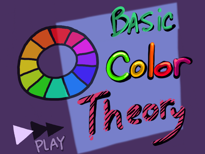
Here's a quick tutorial on color theory.
#Tutorial #colortheory
#birdytutorial #colors
Comments
9+
like
reference image
eraser
eyedropper
time taken
nsfw
flip
undo
paint with friends
private
used tools icons
500
100
25
5
1
The comment has been reported
The Colors! Gallery moderators will look at it as soon as possible.
delete comment?
just delete
delete comment and prevent this user from commenting on your paintings
report as inappropriate
confirm
Comments
25 Jan, 2014, 6:08 am
Great tutorial! Definitely helped me a ton. Gonna try some contrasting paints now! :D
25 Jan, 2014, 6:12 am
hi
25 Jan, 2014, 6:25 am
Thanks guys! I might do more about values and perspective sometime. and maybe how light affects objects, but if anyone has a tutorial request let me know.
25 Jan, 2014, 6:28 am
Very nicly done, felt like I was in Design 102 again but minus the lectures.
25 Jan, 2014, 6:31 am
THIS IS FANTASTIC! This is the stuff I need to keep in mind. I get lazy and forget these things. Best tutorial ever! *likelikelikelike*
:]]
25 Jan, 2014, 6:40 am
Perspectives would be a great tutorial. Since I was younger I've had trouble with vanishing points and perspective. Teachers would talk about it but I have a ton of trouble on keeping it organic looking, always makes the picture very stiff.
I also noticed while looking through your Gallery you have many fantastic human paintings. There is nothing I struggle with more then making convincing; hands, lips, hair....the whole body really.
Basically if you could teach what throwing thousands of dollars at a school didn't, that would be great haha. Anyway great tutorial again!
25 Jan, 2014, 6:40 am
my title screen looks like a 90's cartoon.
25 Jan, 2014, 6:41 am
@Squishes Sure! i'll do a portrait tutorial too!
25 Jan, 2014, 6:50 am
Portraits, there we go! I had a brain-hiccup on what to call them. "Human paintings" haha..
I'll keep an eye out for future tutorials from you, thanks.
25 Jan, 2014, 6:51 am
THE THEORY IS GENIUS!
25 Jan, 2014, 6:54 am
thnak you a lot! I was my whole life asking for something like this!
you deserve a medal.
btw I would apreciatte if you help me with this by commenting about my mistakes on my paintings in the future.
25 Jan, 2014, 7:21 am
Thanks for this tutorial. I know what complimentary colors are and how to use them, but I forget about harmony colors. I mostly just use a verations of one color so maybe thats why my pics sometimes look dull compared to yours and everyone elses.
This is really helpful
25 Jan, 2014, 7:58 am
yeah, we had that in school. but a great tutorial. youre example-pics are nice. will u draw them out?
25 Jan, 2014, 8:28 am
very nicely done
25 Jan, 2014, 8:35 am
i am putting the knowlege you shared to use and it's not working too bad for what i'm doing.
25 Jan, 2014, 9:16 am
great tuto thank's
25 Jan, 2014, 5:30 pm
@skykai Maybe, I have a large backlog of unfinished doodles and I make loads of thumbnail images to get ideas. I'll probably do a tutorial on that too to help people with composition and values. haha
25 Jan, 2014, 7:10 pm
Very good! It's unfortunate that few people know of this.
Hopefully more will see this and it will help them.
*Claps*
25 Jan, 2014, 9:19 pm
Well that was interesting, I never knew about this. :D Thank you so much!
I wonder if my paintings are kinda dull when it comes to color?... I'm not really sure. I think they might be.
25 Jan, 2014, 10:02 pm
Color saturation is another thing I should go over when I do values. Having less saturated colors is fine! All of your work is lovely!
25 Jan, 2014, 11:24 pm
This was awesome! *claps* :D
You should do another tutorial, going deeper into this "Color Theory." :) This really helped me A LOT.
27 Jan, 2014, 12:06 am
This was well explained better than an art teacher, you sir are king of tutorials ^-^ ( or queen dont know lol ) I found this more enjoying to watch than a boring tutorial video on youtube XD Keep up this wanderful createful work Birdy ^-^
27 Jan, 2014, 3:15 am
Aw, thank you Techno-bits! I'll be making some more tutorials soon. It's really fun!
My real name is Crystal, a lot of people do assume i'm a guy though I dunno why. haha!
27 Jan, 2014, 8:42 pm
Great tutorial! It's a great review for me. Another color scheme you could've talked about is split complementary, which is taking a complent, let's say orange and blue, and instead of using blue, you use blue-green and purple. It also could work if you keep blue and use red-orange and yellow-orange.This complent creates a Y on the color wheel.
27 Jan, 2014, 9:44 pm
Yes! i'm currently going over that on my next tutorial.
30 Jan, 2014, 6:10 pm
WOW! i never notice that using blue and orange was the right choose LOL! i just thought it look nice the eye ^__^
thank you i forgot about those things specially the "blue & orange, green & red" thing this help alot!
30 Jan, 2014, 6:14 pm
oh that orange & blue thing, i meant my OC, he has the purfect colors, go check him out if you got the time please i love comments! ^__^
31 Jan, 2014, 4:16 am
This is incredibly helpful, thanks so much for making this :'D
31 Jan, 2014, 4:40 pm
I already knew some of this, but you explained it a lot better than anyone else who has tried to explain it to me, plus there was a lot of things that I didn't know in this tutorial. Great job ^-^
01 Feb, 2014, 9:39 pm
Awesome tutorial, thanks! I hope it helps allot
03 Feb, 2014, 3:23 am
Thank you for commenting! ^-^
Your art is incredible, by the way! Very inspiring gallery. I'll have to keep an eye on it.
And I'm the worst with colouring, so this helps alot!
11 Feb, 2014, 4:23 am
That's most awesome basic
tu-theory-al I've seen..ever!
Can't believe "Queen of art" is following me :D
12 Feb, 2014, 4:29 am
Cool! This helped alot!
15 Feb, 2014, 10:58 pm
thanks, this is very helpfull :)
18 Feb, 2014, 7:14 pm
This makes for a good lighting/shading tutorial! I might just recomend this to some people ^_^
22 Feb, 2014, 4:30 pm
really helped thanks
24 Feb, 2014, 4:47 pm
Thanks guys i'm really glad you like it. Part 2 will be up soon. :D
27 Feb, 2014, 9:35 am
Thankuu sooo much! This really helped me a lot. ^ ^ This looks like it took quite some time, so bless your heart. xD
28 Feb, 2014, 6:22 pm
amazing! please make more, thanks for sharing!
15 Mar, 2014, 12:08 pm
Very informing.
30 Jun, 2014, 7:00 pm
you need to be an art teacher. just saying. Im sort of teaching myself teqniques as i get better and this helped. thanks!
30 Mar, 2015, 2:29 pm
Cool this helps thank you.
19 Sep, 2017, 2:25 am
Thank you so much for this!! I've learned some awesome tips! :D
03 Dec, 2021, 1:46 pm
Great tutorial, very helpful!
27 Jul, 2022, 7:05 pm
I LOVE THIS TUTORIAL !!!!!!!!!!! ★ο★
21 Jul, 2023, 4:32 pm
Thanks!
28 Jul, 2023, 2:54 am
@astr0audr3y
28 Jul, 2023, 5:22 pm
@ArtzyAstro