
Ponder by MyFaceYourFace
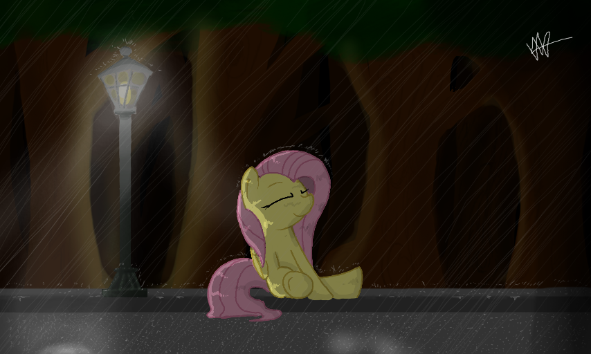
Sometimes, the rain feels nice. As if it washes away my worries...
Practice with shading.
Need to study trees so I can draw them properly : P
#mlp #pony #fluttershy #rain #reflect #cute #lamp
Comments
9
like
reference image
eraser
eyedropper
time taken
nsfw
flip
undo
paint with friends
private
used tools icons
500
100
25
5
1
The comment has been reported
The Colors! Gallery moderators will look at it as soon as possible.
delete comment?
just delete
delete comment and prevent this user from commenting on your paintings
report as inappropriate
confirm
Comments
13 Jan, 2014, 9:15 pm
i'm no artist of anyway but if you wont my opinion here it is.
i like the small detail of the front lag bent on the lower leg that adds alot.
the rain looks amazing! keep that up ^_^
the trees in forground and background look good to, semple but good. :)
the hair or mane looks semple to but i think the lines should of been a little lighter but oh well, its your way of drawing. :)
cute fluttershy btw! /)^3^()
and of couse the lighting, sense i cant draw lighting and/or shadow for crap i said it looks really good ^__^
all and all! 10/10 awesome job!
13 Jan, 2014, 9:33 pm
Just waiting for the My Neighbor Tortoro refrence
13 Jan, 2014, 10:21 pm
I love the mist around fluttershy/ground.
This is a great pucture, but the colors could use some improvement. :P
(I'm sorry if this is poorly worded, I've never been very good at explaining things.)
First, I reccomend NOT making fluttershy bright yellow/pink like she is in the show. I used to perfectly match a character's colors and wondered why they sometimes looked out of place.
Try using a less saturated blue-ish green instead of yellow.
Second, those trees' look odd too don't they? That's also because of their colors.
For those, mess around with a dark cyan color, with a more green-ish for the highlights.
The best way to learn about color stuff like this is to sc.rew around, try stuff, test stuff.
It's what I.ve been doing in ALL of my recent artworks, messing around and seeing what looks "right".
And look at things in person, that helps alot too.
13 Jan, 2014, 10:22 pm
That's supposed to say "fluttershy/the ground." I noticed it when I hit 'post comment' and couldn't fix it. >_<
13 Jan, 2014, 10:23 pm
#imgoingtotagthis
^ That might help you a teensy tiny bit.
13 Jan, 2014, 10:25 pm
What I also forgot to mention is that the grass on that is a cyan color, not a green.
Heheh...sorry for all these comments, MF....I'll go now. XD
13 Jan, 2014, 11:15 pm
No man It's alright.
I always respected you for your patience when doing art...I tend to rush : p
14 Jan, 2014, 1:33 am
I seriously love how you have the rain drops splashing on everything, so cool! And I love rain too ^u^
As for Krazy's comment, I agree. using different colors to shade/color a picture can make it look more appealing and interesting.
If you took yellow, you could shade it with orange (for a warm feeling), or green (for a cooler feeling).
If you wanted a darker feeling, you could shade with dark grey or black.
Long story short, color therory helps ^u^
14 Jan, 2014, 3:12 am
This looks lovely. ^-^
And Fluttershy looks adorable. :3