
Things just got Serious... by SoulShaderDraws
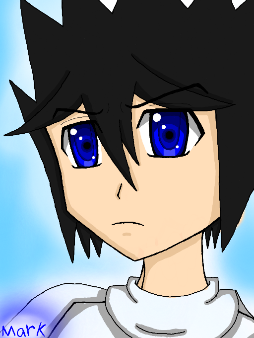
Ok before you guys say anything. look at the drawing before this and be honest...DOES THIS LOOK BETTER THEN WHATEVER THE HECK I WAS DOING BEFORE?
This looks closer to the manga style then the other one...this really is showing change. i have to say its honestly frustrating seeing better work and you look at yours feeling IT CAN BE BETTER! and what it takes to get better. man its freaking HeII i tell you...
#anime #manga #style #blue #cool #improvment #better #nice #blue #male #kid #black #ha
Comments
9+
like
reference image
eraser
eyedropper
time taken
nsfw
flip
undo
paint with friends
private
used tools icons
500
100
25
5
1
The comment has been reported
The Colors! Gallery moderators will look at it as soon as possible.
delete comment?
just delete
delete comment and prevent this user from commenting on your paintings
report as inappropriate
confirm
Comments
28 Dec, 2013, 9:46 pm
dang...what happened...just look at the change...from cartoon to mangs style...its crazy O_O;
28 Dec, 2013, 10:43 pm
It's good if you like it! Something changed, that's obvious.
28 Dec, 2013, 10:49 pm
Really? Maybe on another website. Here...probably not,unless I feel its worth the time and effort to make one. <v<''
29 Dec, 2013, 3:35 am
Make the pupils a bit larger, show a bit more relaxed-ness with the hair (Give it a reason why his bangs stand up like that. show stuff like threads of hair, some splits. define it a little. give it highlights (Not like girl highlights, lol) show some lights angles and dark angles. the lineart its decent, but try rounding out the edges, like his chin, try not to make it too sharp (If you want to make it look more like a boy, box the chin a little.) same with the side of the face/cheek bone. I would say experiment with a little rounding if not a mix of both.
29 Dec, 2013, 3:36 am
now, this is just my constructive criticism ^^ not trying to change how you draw, this is good, dont get me wrong, jut giving you some ideas that might help you :v
29 Dec, 2013, 5:02 am
:< I NEEC IMPROVEMENT
29 Dec, 2013, 5:17 am
STUDY THE ORIGINAL JP F--- MANGA
29 Dec, 2013, 10:02 am
Ok, ok. I don't like theneyes because it's not my style. It looks too Diamondshaped and the coloring of the eyes are much more/better than the rest of his body and that makes his eyes stand out too much. Actually you could say that there is nothing wrong with the eyes, but more with Mark himself.
I just noticed that you're learning to draw Mark from Mark XD
29 Dec, 2013, 10:04 am
Funny how Retro says that noone has hair simply with spikes coming out of it, but look at Naruto XD But you should improve the hair. You don't want him to look like Naruto, do you?
29 Dec, 2013, 7:49 pm
Fine, show me the improved eye, but I hope you understand that drawing the eyes is the best thing you can do and it seems that you only want to improve that right now.