
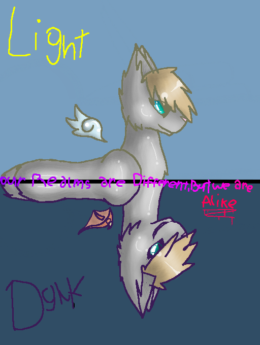
Our realms are Different, But we are ALIKE... by *KittyKrew*
i like how this turned out :D
#LightDark #Lightwhisker #Darkwhisker #WARRIORCATS #WARRIORS #KittyKrew
Lightwhisker - Light
Darkwhisker - Dark (well, duh. XD)
Realms of Light and Dark, who bites harder then their bark, the Good...? or the Evil...?
Comments
5
like
reference image
eraser
eyedropper
time taken
nsfw
flip
undo
paint with friends
private
used tools icons
500
100
25
5
1
The comment has been reported
The Colors! Gallery moderators will look at it as soon as possible.
delete comment?
just delete
delete comment and prevent this user from commenting on your paintings
report as inappropriate
confirm
Comments
04 Nov, 2013, 8:27 pm
aw i like the idea ! :3
04 Nov, 2013, 8:56 pm
COME TO THE DARK SIDE!!! ......we have cookies.....
05 Nov, 2013, 7:28 am
*squints eyes and stares*
e3e....Did you borrow some of emma's (tlc) lamp oil?
Because it sure looks like it! dB
Your shading and highlighting skillz are improving, wooo.
Some suggestions that could have made this even better than it already is:
On the 'dark' side, use cooler and slightly darker colors with some saturation but not TO DA MAX. That would look better with the darker outlines.
As for the 'light' side, use warmer colors.
You see, if you're using light outlines (meaning, ones that are 'delicate' and 'soft' in color) you want to use soft and light colors to go along with them. The opposite goes for dark outlines. Stuff looks quite better that way!
Derp around on dA and you'll see what I mean. Or try it for yourself :P
But what do I know? I'm still learning how to properly paint colors, afterall XD
05 Nov, 2013, 9:29 pm
^ty :D
@Kattana: ty for le tip. XD (totalystoletlc'slampoil XDD)
05 Nov, 2013, 9:30 pm
@Nathan: *jumps to le dark side into mountain of cookoes* oDo CEWKEEZZZ